
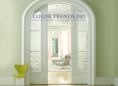
BENJAMIN MOORE ANNOUNCED IT’S 2015 CHOICE FOR
“COLOR OF THE YEAR”
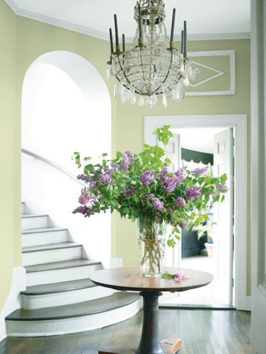
GUILFORD GREEN
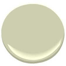
I Don’t use much green as the main colors in my home, now, but I did in our first home. And Guilford Green reminds me of a SLIGHTLY LIGHTER VERSION of a color I LOVED and used in our first home…a Laura Ashley color called HEATH GREEN. Maybe that is why it feels a bit 90’s to me. Still as a challenge I like to find a way to make any color work…

WHAT I DO LIKE ABOUT GUILFORD GREEN IS IT’S VERSATILITY.
At first and maybe even second glance…it can read a bit drab…even sad to me. However, there has been so much gray and greige and beige… that it could be refreshing to have a quasi-neutral that has woodsy green color to it…a color that can be an ensemble player and not upstage the other colors…in fact I think it NEEDS colorful friends around…which keep it from being to blah…
HERE ARE SOME COMBINATIONS I LIKE…EACH CREATES ITS OWN UNIQUE LOOK. I SAY…TAKE IT AND RUN WITH IT….
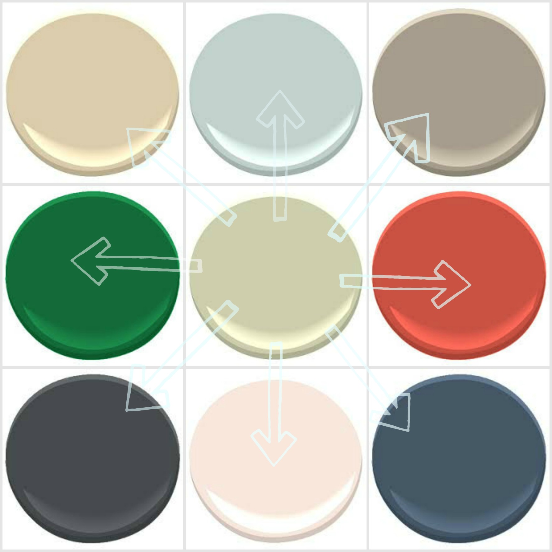
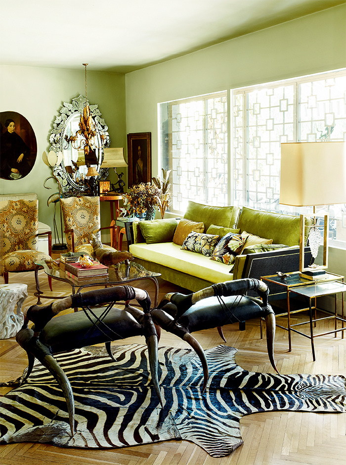
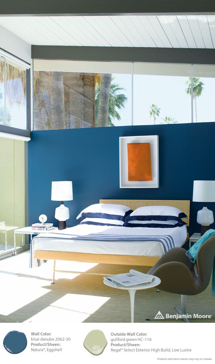
WITH THE DARKS…EDGIER AND CLASSIC…
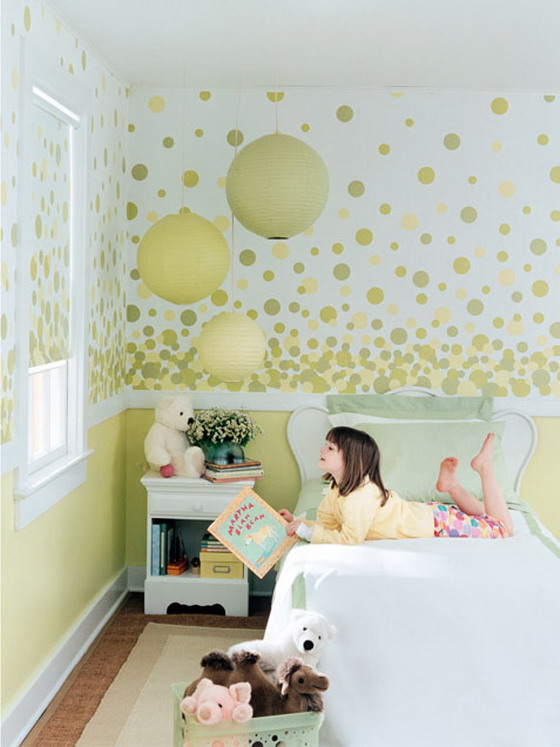
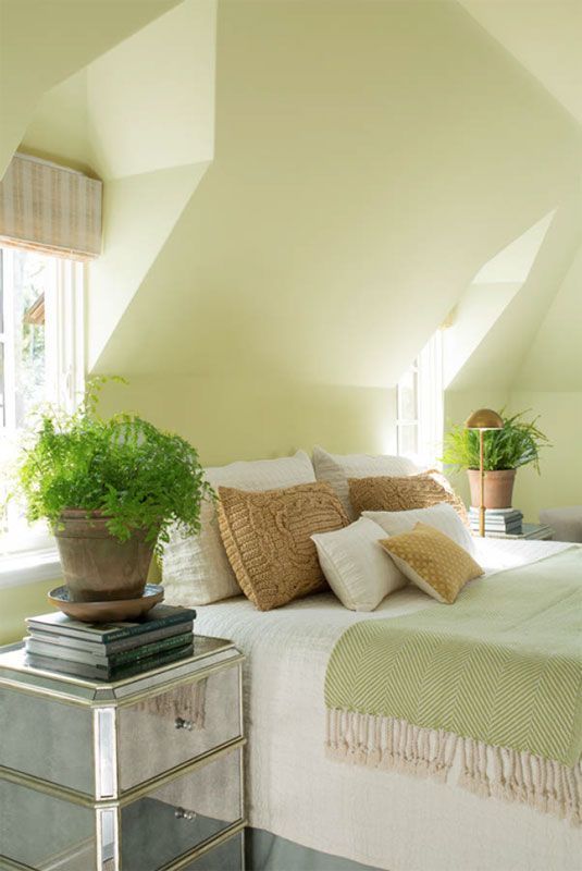
PRETTY PASTELS….
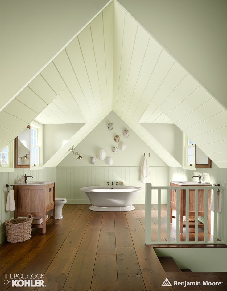
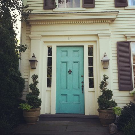
I AM ALWAYS DRAWN TO THE COASTAL BEACHY PALATTES…..

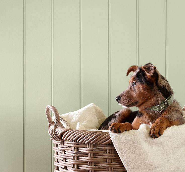
AND EVERYTHING ALWAYS LOOKS GOOD WITH A PUPPY…
XO
I don’t know, I don’t hate it, but I don’t really like it very much. I doubt I would choose it for my home.
I have to agree…don’t hate it..but not swooning…Hate is such a strong word…especially for a color….but if I moved into a house that was painted this color…I might be inclined to change it…
now…I might actually have to use the “H” word when talking about the Pantone color!
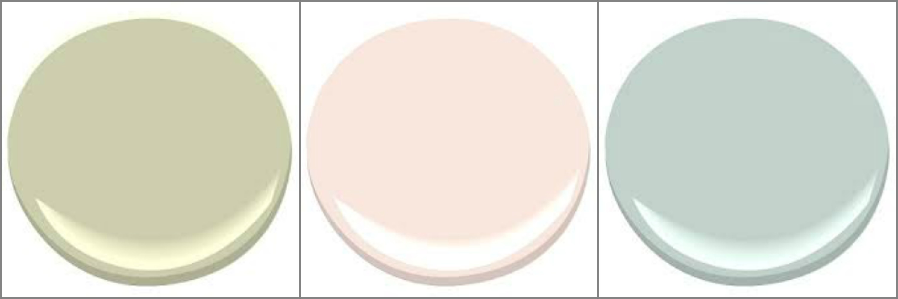
The pic of Guilford Green and Peacock Blue is actually Timothy Straw and Jack Pine. Here is the link to the BW brochure. http://media.benjaminmoore.com/WebServices/prod/colortrends2015/index.html