YELLOW
My husbands favorite color and a color which I also adore.
Apparently YOU love it too…as one of my most READ posts of all time…is
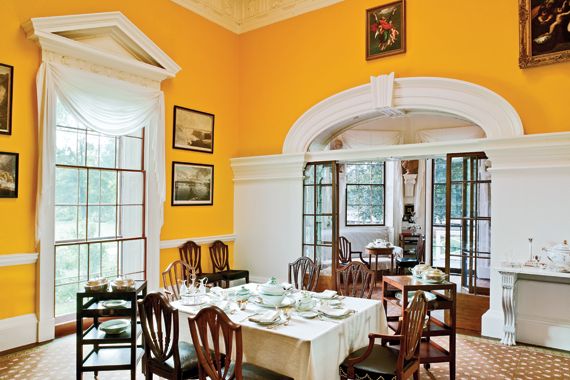
YELLOW in decor can be a GREAT compliment to almost any other color..and YELLOW can act as a superb neutral.
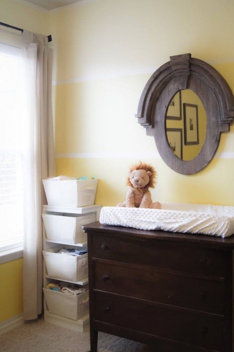
It is also a VERY EASY coIor to get Wrong. There is a FINE line between…TOO MUCH…and JUST ENOUGH. Too much lemon, Too much gold, Too dark, Too bright or florescent…… JUST TOO YELLOW…..It can be difficult to gauge from a small sample card of yellow how it will translate to an entire room.
And rarely is the complaint “It is just NOT YELLOW ENOUGH!”…

Over years of hit and miss, my paint color selection process has evolved. NOW, If I desire a PALE YELLOW, I will look for samples which read a tad “barely there”. These yellows are some of the BEST Interior and Exterior PALE YELLOWS and when they are painted over whole walls….come to life and soar.
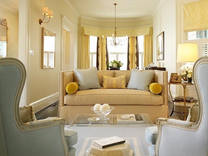
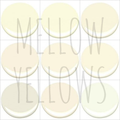
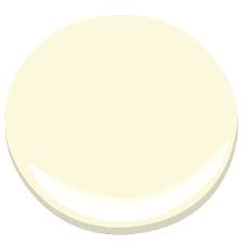
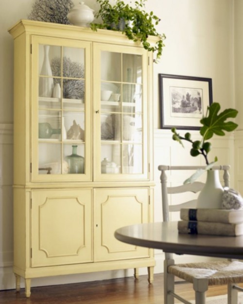
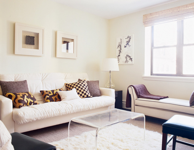
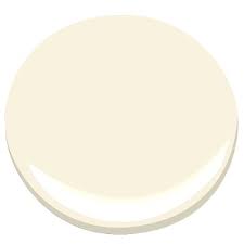
I have compiled a list of 10 of my favorite Benjamin Moore MELLOW YELLOWS…

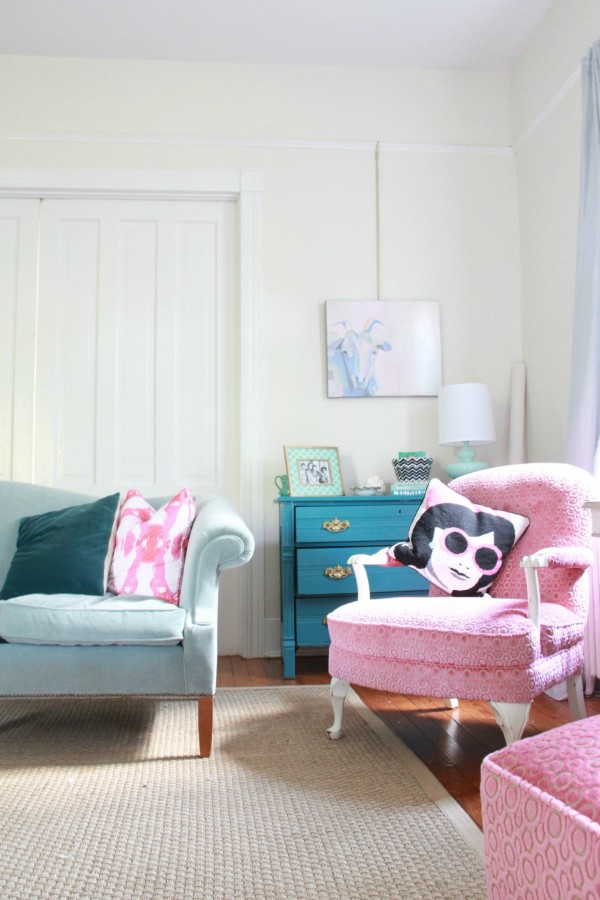
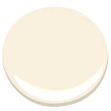
(WINDHAM CREAM IS #1)
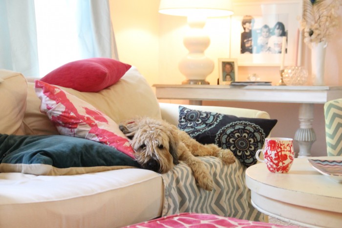
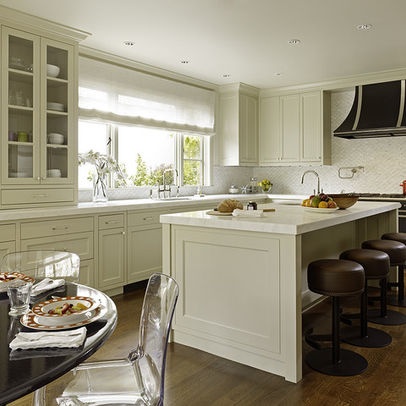
These are not to be confused with NEUTRALS WITH A YELLOW or GOLD UNDERTONE , though some of the following colors could straddle both worlds. Instead, this collection is for those of you who desire an ACTUAL “LIGHT YELLOW” room. A soft quiet pale yellow color that does not require sunglasses and can still PLAY host to and COMPLIMENT other colors !

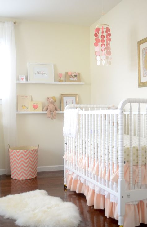
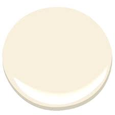
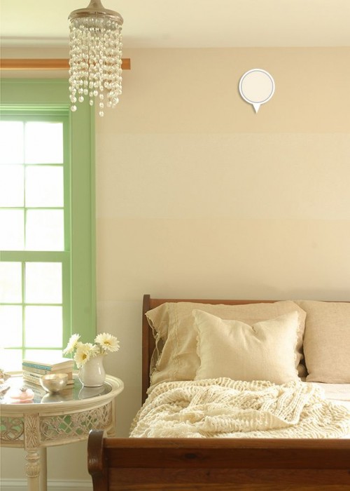
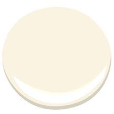
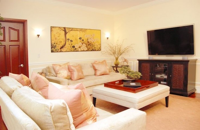
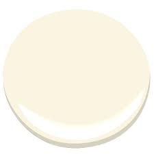
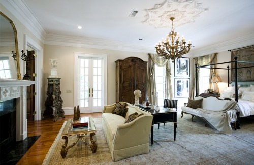
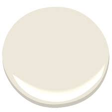

If you spend as much time as I do Online …exploring color…keeping track of this COLOR OF THE YEAR….and THAT COLOR OF THE YEAR and what is HOT and what is NOT…you, well I, have become a bit immune to the influence of trends and pretty much stick to what I LOVE. YELLOW, in my humble opinion, will always be a beautiful choice…like the sunshine which inspires it…
…we could always use a little YELLOW!

I painted a bedroom in Vanilla Ice Cream, Aura paint, matte finish. It turned out much lighter than the Houzz picture indicated. It truly is the shade of vanilla ice cream- check out a carton of Blue Bell Homemade Vanilla ice cream and you will have this color!
It may have very very faint yellow undertones, but you would need a magnifying glass to find it. It’s a nice creamy white.
Photos of room rarely capture the color right, but they capture an essence of the color as it relates to the space. I always try any color in my own home or space first. I have learned this lesson the hard way.
What is the name of the yellow in the pale yellow bathroom at the end of this article ??
Do you know the name of the yellow bathroom at the end of this article? It’s perfect!
I used Mellow Yellow for my kitchen and I love it. It’s not too light and not too bright (to me anyway) it’s from Benjamin Moore. It really brightens up my dark kitchen
HI, may I ask what is best trim to go with windham cream? your photo is lovely ! thanks
I am uncertain of the color name, I was never able to track
It down (and I tried ) however , I looks a great deal
Like a Sherwinn Williams color called “daybreak”.
In general – my advice when looking for a soft pale yellow is to go
To the “whites” and find the most yellow one . Everything else ends up being “too yellow “ of that
Makes sense . Good luck !