IT is not my nature
to follow trends in my decorating style – though I do have to admit to picking up a few along the way.
However – I am fascinated by them. In fact, I think if I were to be in college I would want to take a class called
“The Psychology of Trends”
What makes them start? What makes them stick? I kind of know what makes them go away – either they are not truly appealing or they get OVER played. Did you know we are hardwired to dislike something that we are over exposed to?
Just for fun – how about we explore some of the trends predicted by the HOUSE BEAUTIFUL LIST FOR 2018 –
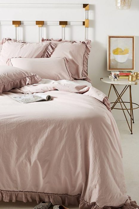
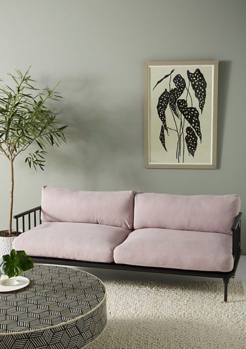
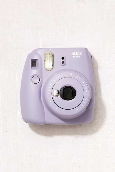
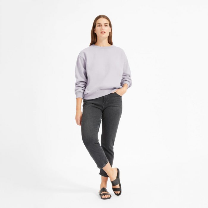
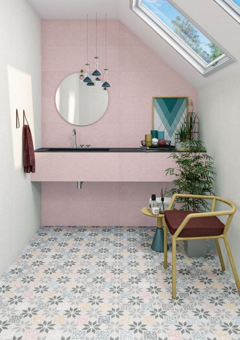
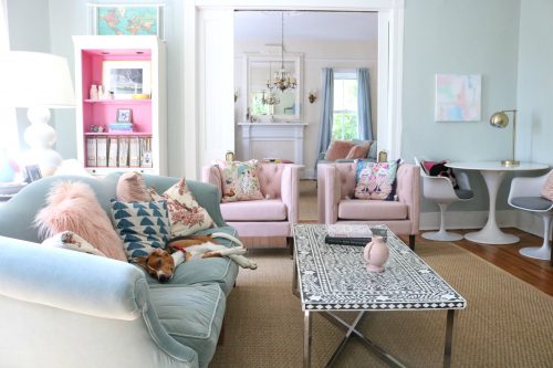
*1.LAVENDAR -On the heels of “Millennial Pink”Lavender becoming the “IT” color was kind of a no-brainer . One pastel swapped for another pastel. The thing is that – like pink – there are so very many versions of it – some more widely appealing than others and I am not quite sure the “millennial” version – has been nailed down. The more muted “grayed down” versions have a tad more staying power. I notice that when a color can act as a neutral – like Millennial Pink – it has stronger staying power. The trouble is that the further away we get from true lavender – no one seems to know what to call it. But in the right doses and in the right settings – they are truly beautiful .
*2. HIGH CONTRAST PALETTES – The mix or heavy dark woods and peaceful light whites and grays has never been more popular. Thanks to the influence of FIXER UPPER and MAGNOLIA HOME we have seen first hand how simple contrast can be EVERYTHING. In its purest sense – I happen to love a little more color personally – but I think with simple neutrals as a backdrop – almost anything is possible.
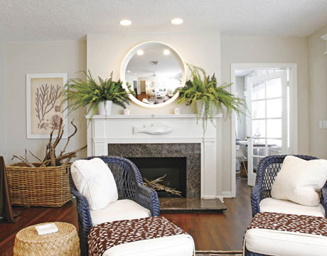
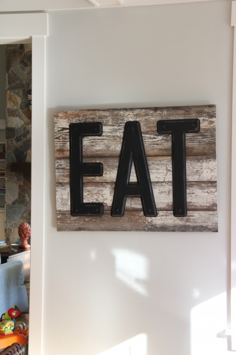
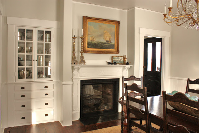
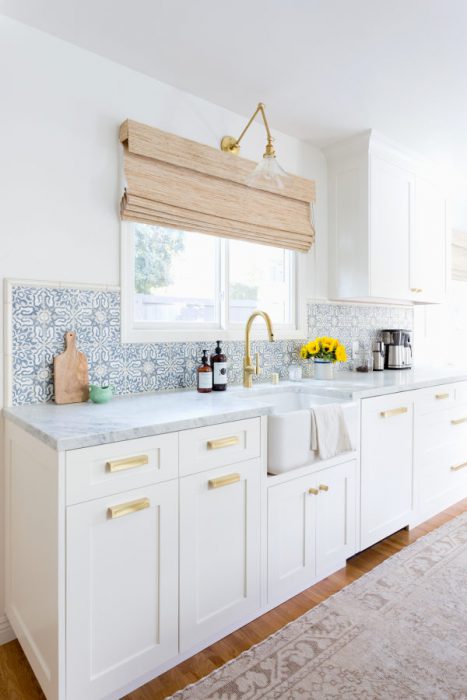
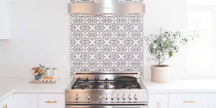
*3. TILE TWISTS – I love this one! Yes, I still adore my sweet simple Subway tile – But I love about the exciting things happening in tiles – especially backsplashes – they are fun and unique and if needed – not ridiculously hard to change.The influences are far-reaching – MORROCAN AND SPANISH. Like wall paint color – these changes CAN BE less expensive – in the BIG picture – and an offer opportunities for personalities to shine and decorating tastes to become more personal.
I ADORE THIS KITCHEN FEATURED IN STYLE ME PRETTY
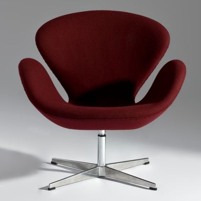
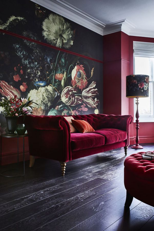
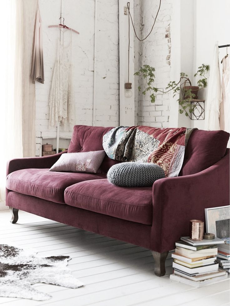
*4. WARM COLORS – I never think as any color really being in or out – just easier or harder to find. Deep warm colors ARE MUCH easier to find right now. Reds, burgundy, deep orange…lovely.
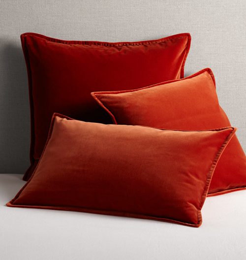
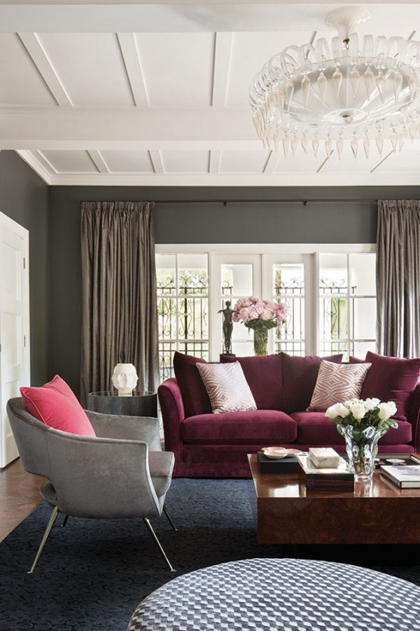
TEMPO DA DELICADEZA
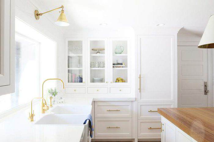
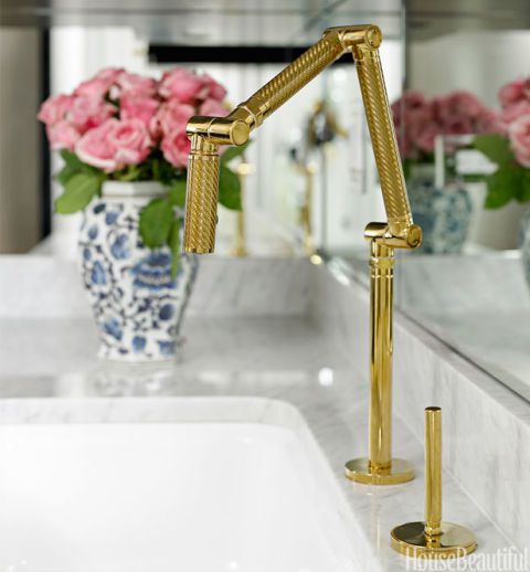
*5. BRASS ACCENTS – Brass accents have been on the scene for a few years now – the good news is that they are more widely available and there is more variety in the choices. I love Brass accents – they are timeless and very classic.
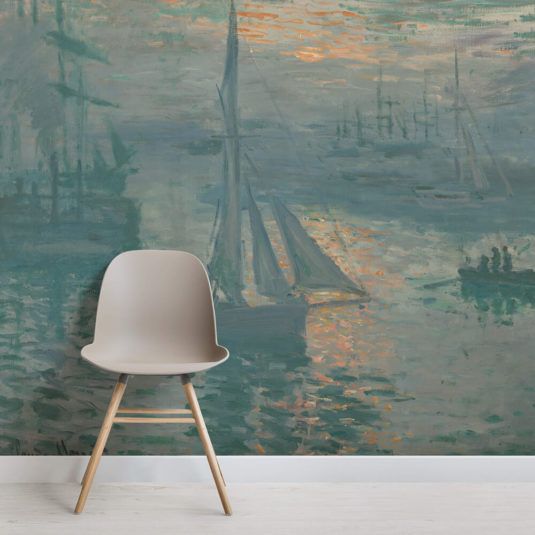
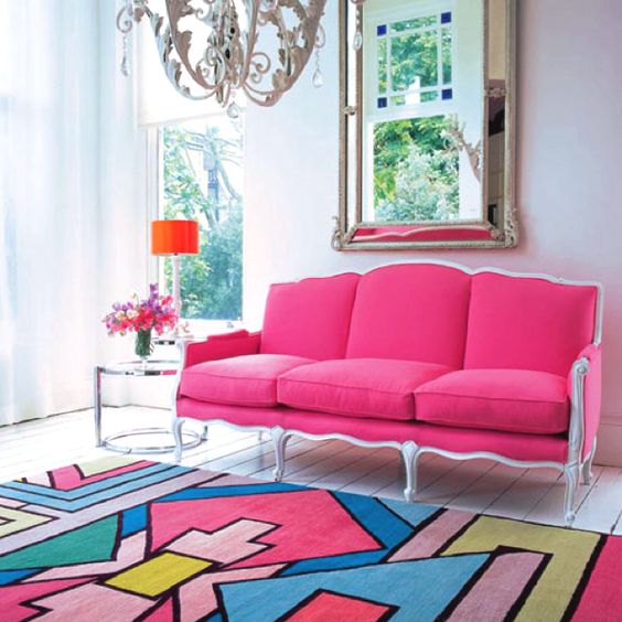
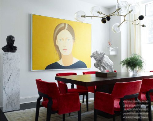
*6. BOLD PATTERNS – I CANNOT get enough of these. Large scale ART, big statements – they ast as an anchor and whole house can be designed with them as a jumping off point!
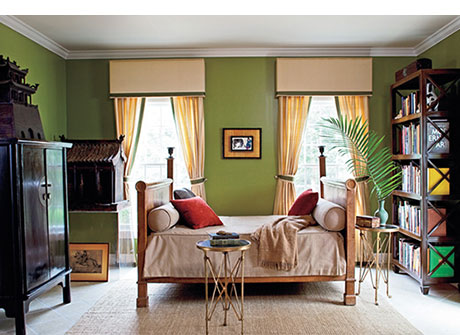
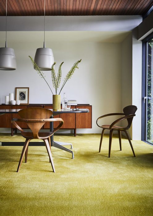
*6. OLIVE GREEN – I have been a HUGE fan of all things OLIVE Green – well – forever. It looks great with blush!
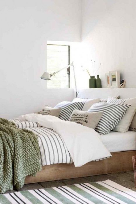
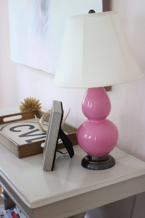
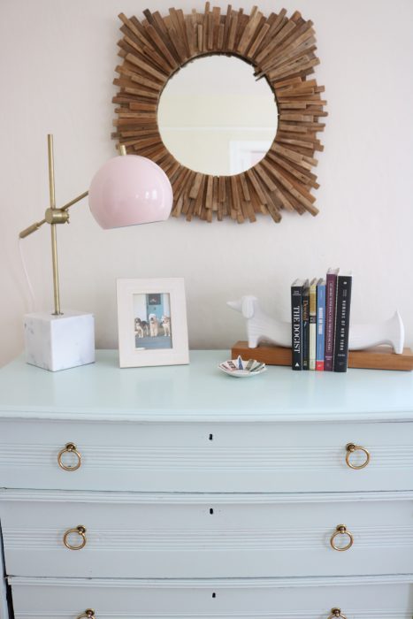
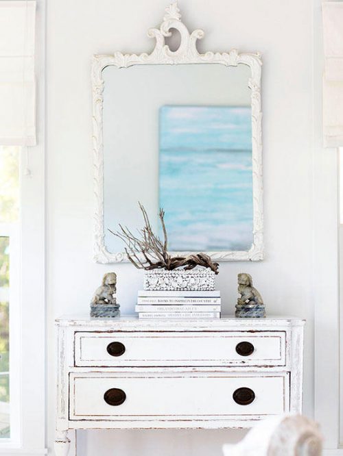
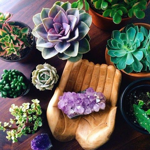
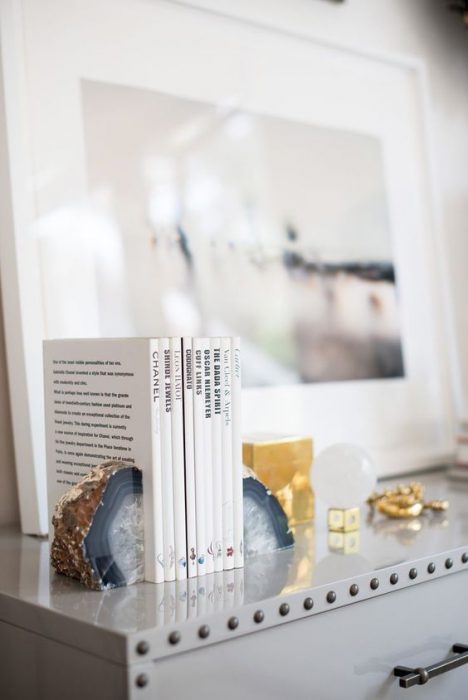
*8. NATURAL ELEMENTS – Natural elements ground a space. They balance the pretty and give rooms a deeper connection to the earth. I have a feather collection – gathered in my yard and a pair of deer horns that one of the dogs brought home. And my beloved driftwood mirror!
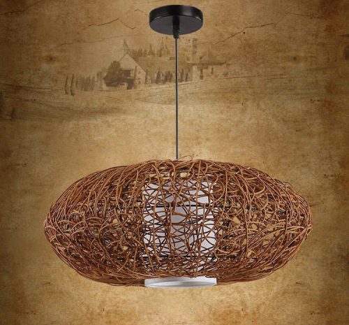
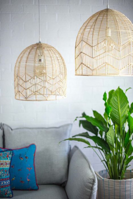
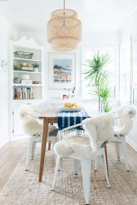
*9. WOVEN TEXTURES – Seems like you can’t throw a ball inside without hitting a women light fixture. I do love them – but I have this very dusty house and i find that they can sometimes collect dust. Still, I LOVE the way they look…the depth they add and the warm light.
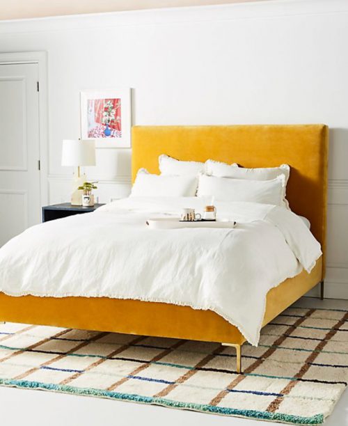
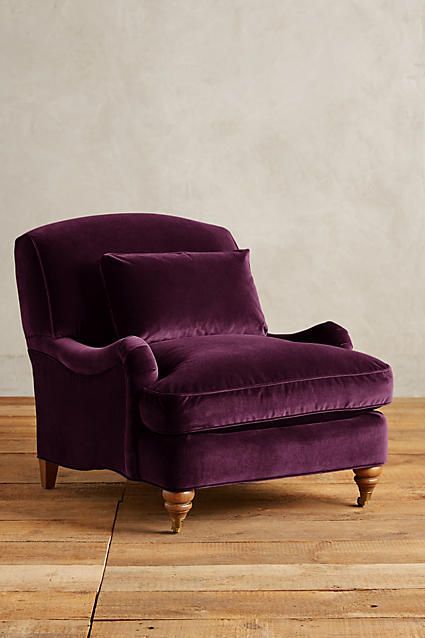
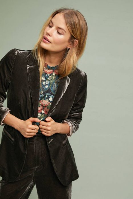
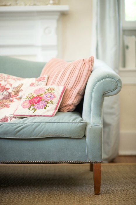
*10. VELVET FURNISHINGS – LIKE I said – some things are timeless – like velvet – but it is a bit more mainstream right now- all the better for me…MORE COLORS!!!
So there you have my run down of some of the trends that have stuck. I suspect that the predictions of 2019 are right around the corner! And ideas?
Wow that room with the pink is just amazingly pretty