
PINK and I go way back.
BACK TO THE BEGINNING IN FACT.

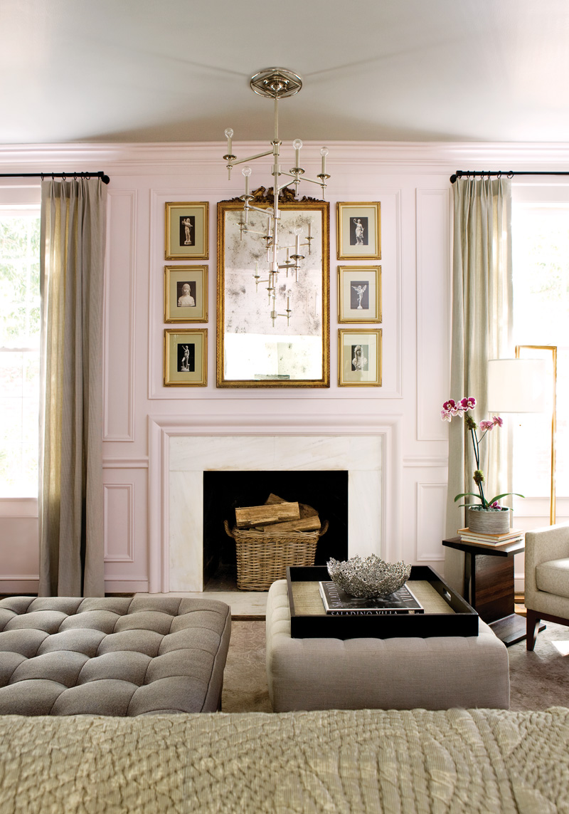
And 5 years ago I made the SERENDIPITOUS discovery that I could use PINK as a wall color, much ike a neutral…to enhance the other colors…IF I chose wisely.

HERE ARE MY 5 PINK RULES:
1. LESS IS MORE
2. BALANCE
3. START SMALL
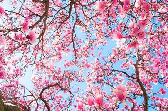
4. LISTEN TO MOTHER NATURE
5. BE BRAVE – IT IS ONLY COLOR


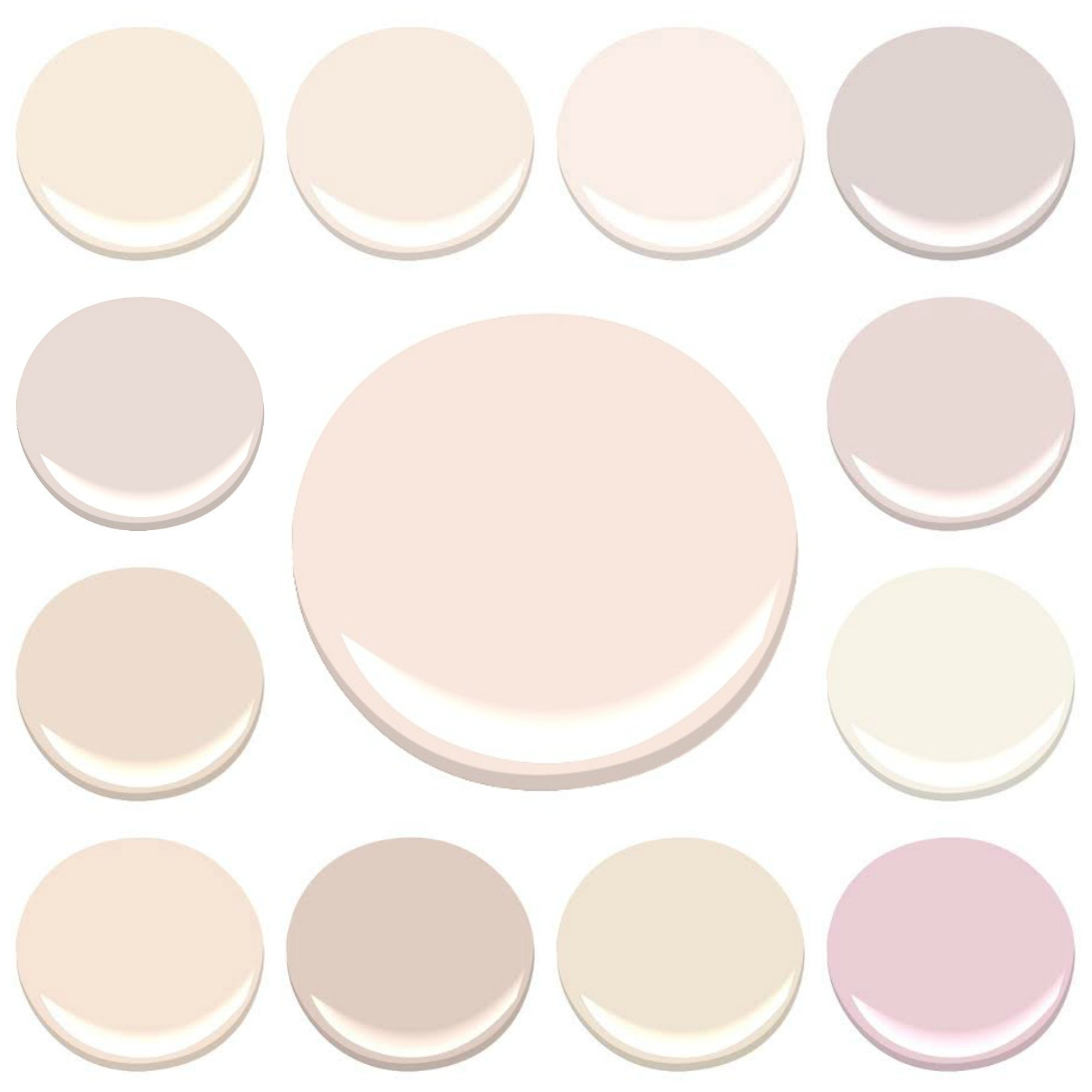
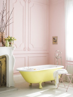
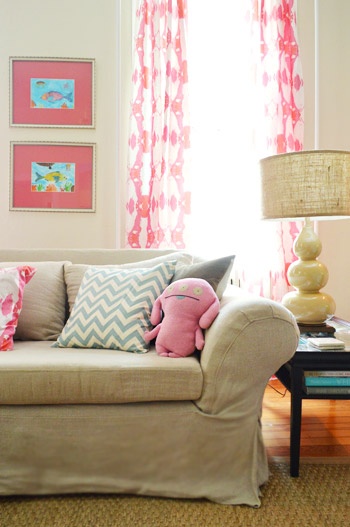
1. LESS IS MORE – when you are choosing your wall color. Find a color you like, and then choose the one a tad lighter. The Deeper a pink gets, the more “little girl” it can appear.
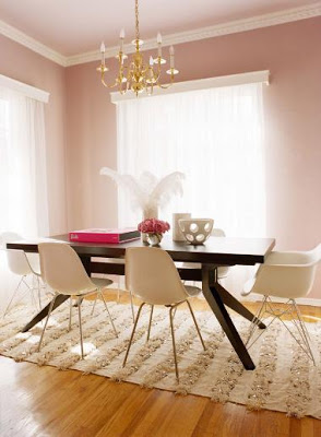
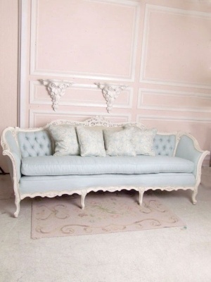
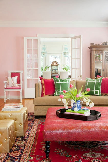
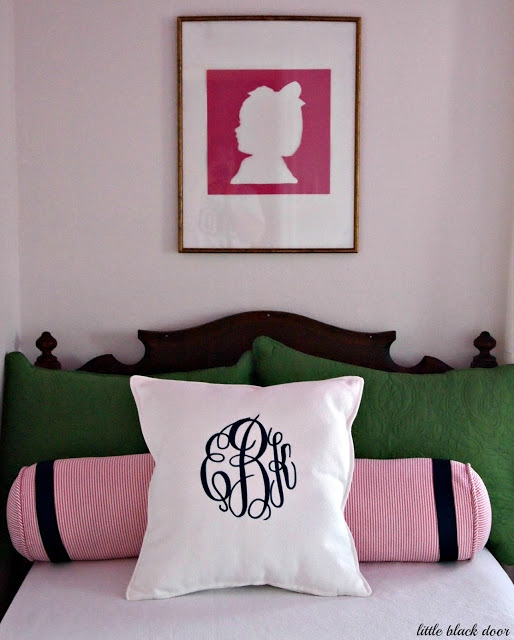
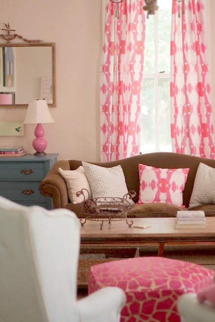
2. BALANCE – THERE IS A REASON WHY PINK AND BLACK, PINK AND BROWN, PINK AND GRAY AND PINK AND NAVY COMPLIMENT EACH OTHER SO WELL – THEY STRIKE A BALANCE BETWEEN SWEET AND SAVORY THAT JUST WORKS.

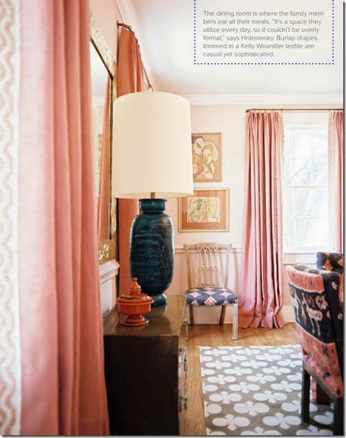

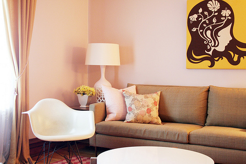
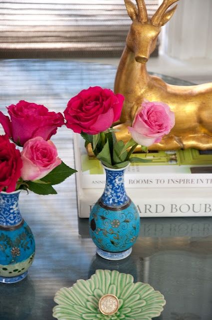
3. START SMALL – A little pink goes a long way. and if you are still testing the waters, start small, maybe an accent wall…or even a pink accessory…that Pop of Color…and see how you feel…
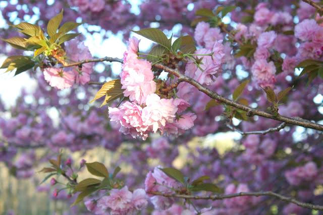
4. LISTEN TO MOTHER NATURE – IT IS THE SURPRISE, THE TEASE, THE HINT ……THAT MAKES US WANT MORE PINK …AND MOTHER NATURE COMBINES ALL THE RULES – BALANCE, STARTING SMALL AND LESS IS MORE…TO GIVE US PINK…THE WAY NATURE INTENDED IT TO BE.
- MIAMEKO.BLOGSPOT.COM
5. BE BRAVE – IT IS ONLY COLOR – LIFE IS TOO SHORT – HAVE FUN!
SPOONFLOWER FABRIC…DESIGNED USING ONE OF MY PAINTINGS!
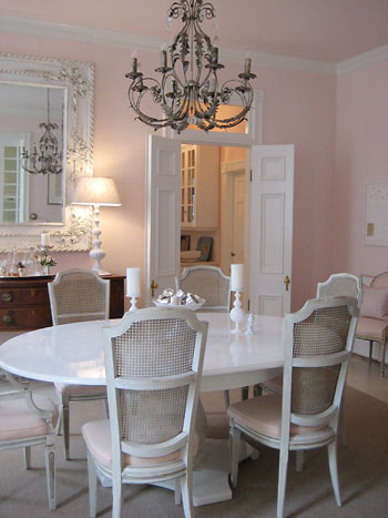
. I have had people ask “What does your husband say?”… My husband loves the pink living room, the wall color does not offend nor challenge his masculinity…any more that a BLUE room does mine…He only cares that the room feels good to be in, to hang out, watch a movie or read…and a PINK room, done correctly, is mature and inviting and beautiful.
Pink is not for everyone, but if you, like me…. are a fan of pink, dive right in, what are you afraid of. GO for it!!!
Pink has only been a “traditional” girl color for a very short time anyway. Before the mid-1800s it was a traditional male color. One of the Napoleons was using blue for his baby boy but it was for religious reasons (the Virgin Mary) so we don’t have to hold on to the feminine pink construct anymore.
More power to pink!
It is all so cyclical isn’t it…”IN” or “OUT”…every color comes around….and as a wise woman once told me…”so, use what YOU like not what is IN…because the only certainty is that whatever is IN will be OUt”…
I love soft pinks. What a great article.
[…] Lesli over at My Old Country House does a nice breakdown on Benjamin Moore pink paints for interior walls, if you are interested. Take a look here. […]
Omg!! Pink is actually my favorite and I’m in the process of looking for an “adult” pink. This really helped me!! Thank you
I’m looking for a complementary color for people’s faces when they come to my salon studio for hair. I do not want it to reflect an unnatural tone on the hair color either! I have nice natural light during the day, and fluorescent and incandescent at night. My currant wall sof turquoise and blue, reflect sallow tones, and diminished warmth of hair color. Any suggestions? Thanks, Anna
Check out a color called “After the Rain”…hard to describe…but like a dusty lavendar but very very warm and cool at the same time!
We moved into a 1916 house a year ago, which has with lots of dark wood trim on the first floor. The walls were painted a neutral beige by the former owner before she put it on the market, and it looks incredibly drab with the wood trim. I’ve been considering a pale pink for the walls, which I think would look incredible with the wood trim. There are just so many to choose from! Every time I think I’ve narrowed it down by looking at photos online, I end up with several more to consider!
hmmmm…. the wood makes it great and tough because you want to hit the right undertone on the pink to compliment not conflict wth the wood. Is your wood dark? golden?…my first and only real advice without seeing things is to say – go lighter than you think…try “first light”…but again, I would really need to see the space.
My classroom is called the pink room. I’m told I need to actually pick out a pink color for the walls. It needs to be calming. Any ideas!? PLEASE HELP
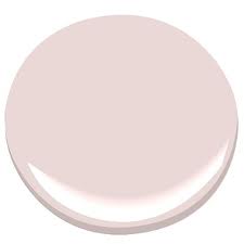
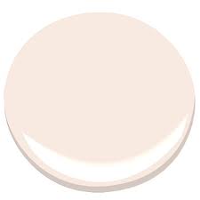
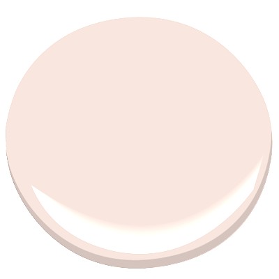
There are a few very pale but beautiful pinks – “tissue pink” is one of my favorites.
I also like , for a deeper color , a 25% lighter version on farrow and ball – “Pink Ground” .
I am removing wallpaper from my kitchen and struggling with a paint color to paint it. I have cherry cabinets with orange/yellow undertones. I was consisting a mushroom taupe color, but discovered Tissue Pink. I just love the color. What is your opinion without seeing the room? Thank you!
I just had my dining room Louis XVI chairs painted BM April Pink. Sadly it’s just a little too pastel/juvenile looking. I would love to hear any thoughts on a better pale pink shade. My home is modern and the liv/din room is very black/ White/cream… chair fabric is wide stripe silk black and cream. I appreciate any thoughts!