
It would be wonderful and oh so much easier if when we were decorating we could just chuck it all and start with a blank slate. But in reality, whenever we are facing a change of any kind, there are usually things to consider…that sofa that was too expensive to replace…the room you JUST painted and needs to work with the new colors, a rug your Mom gave you that you need to make work for now…kids….you get my drift…
so a few months ago, when my friend Terri asked me to help me choose colors…I asked her to make a list of what she COULD change and WHAT was staying. Terri has a lovely home, with a relatively open floor plan…the rooms open up to the other rooms and so the colors need to move comfortably throughout her house.
What she COULD NOT change – The kitchen countertops and backsplash (for now-though it is on “the list”) and the family room walls which she had just painted Benjmain Moore “Putnam Ivory”.
What she COULD change: all the rest of the wall colors down stairs which include…kitchen walls, dining room walls, hallways including the staircase which is open and the living room.
I asked Terri to poke around online and Pinterest and find some “inspiration photos”…here are some samples….
Terri wanted a neutral palate that could include some greens and greigey greens. Here were my suggestions:
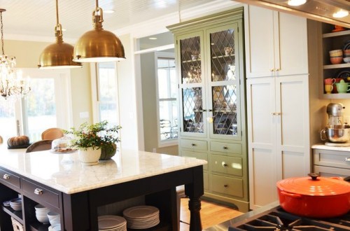
Because the kitchen and the family room are one continuous space I thought she might want to simply paint the limited wall space in the kitchen the Putnam Ivory. It is a soothing, classy color and looks great with there current countertops and backsplash.
HERE IS MY SUGGESTED PALATE:
I THINK THAT THIS COLOR PALATE WILL unify the downstairs, but not rob it of personality …
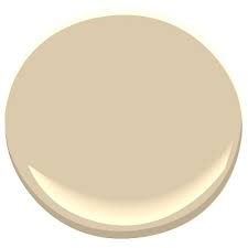
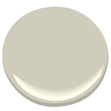
Kitchen and Family room- Putnam Ivory
Living room – Hazy Skies
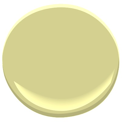
Dining room and hallways and wall going upstairs – Pale Avocado
Upstairs Hall (visible from downstairs – Timid White
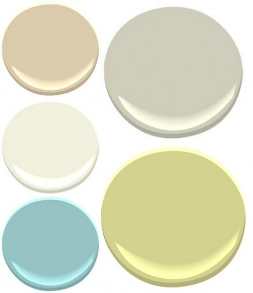
- BENJAMIN MOORE: (clockwise from the upper left) PUTNAM IVORY, HAZY SKIES, PALE AVOCADO, TRANQUIL BLUE AND TIMID WHITE (upstairs hallway)
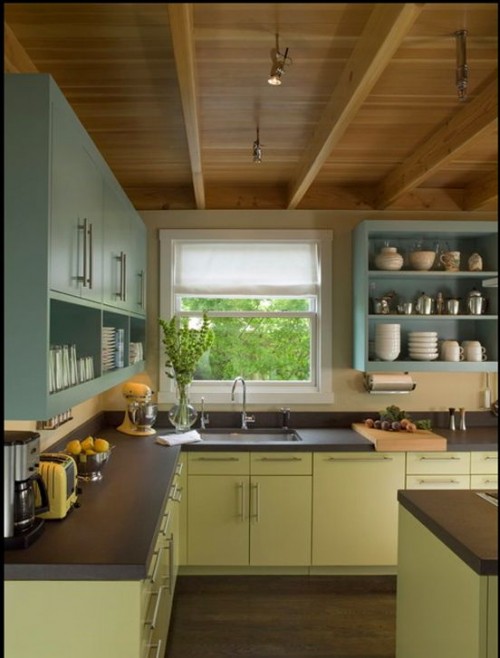
I LIKE HOW THE colors above work with the wood…this color palate would look great in Terris house..
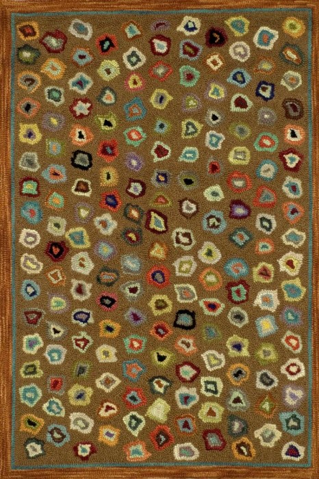
I think this rug “CATS PAW” by Dash and Albert would be incredible as either a Family room rug or runners going from room to room…tying it all together…maybe even up the stairs!!!!
Terri wants to keep her dining room which opens to the front hall and staircase some coercion of Green, but the current green was dated and dark. I thought this one might add whimsy and a more modern feel.
I would add some fun aqua and red accents..little pops, nothing big a vase here, a plate, maybe a painting with those colors………
I LOVE THESE AQUA LAMPS….
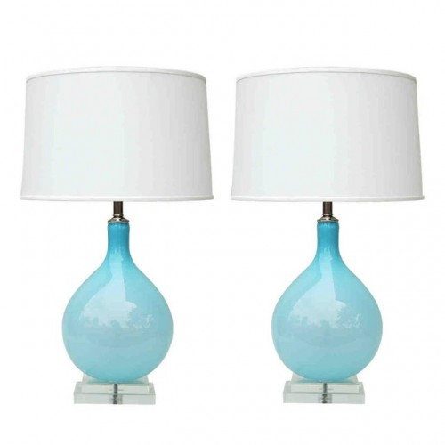
LAMPS!
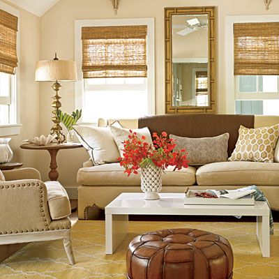
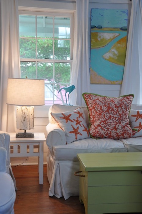
…..the living room, just off the dining room area is decorated in pale neutrals with some pops of aqua. I am a big fan of this pale greige with a green undertone….
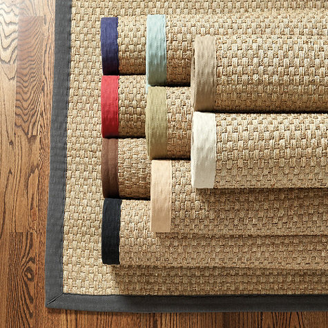
I suggested this rug for the Living room, to add texture and a contemporary feel and complement the antiques and eclectic accessories…..This SEA GRASS rug is one of my favorites so much so that I have TWO OF THEM….
I am excited to see how it all comes together for Terri!!!!
feel free to email me with your color quandaries!
we are at the BEACH!!! Photos to come!
XO
I’ve been searching for the right off white for 6 weeks ! I’ve spent over $200 on samples and my 10 month old thinks the sweet lady at Benjamin Moore is her grandma we are there so much! I’m doing exactly what you discuss here, trying to do a partial home makeover where you redo some parts, but keep others out of necessity. I was looking up whites again on Pinterest and found this piece including timid white and it’s finally the right one! ! It seems not to have too much in the way of undertones but still creamy and beautiful! Love your blog and artwork !!