I AM NOW IN DEEP…trying to choose a color for the living room. I spent mucho dinero yesterday on samples and then decided to give the
BENJAMIN MOORE PERSONAL COLOR VIEWER a whirl…
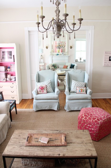
I did not find it the easiest program to navigate… but it is certainly not brain surgery either and finally I got the hang of it…You enter a photo of your room (preferably one that gives you some good wall space to “paint”)…and then you then select from hundreds of colors to try different looks….
here are my choices…any favorites?


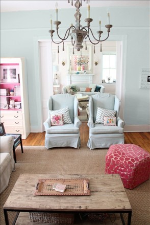
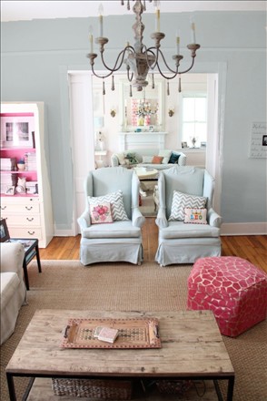
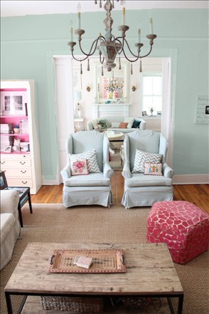
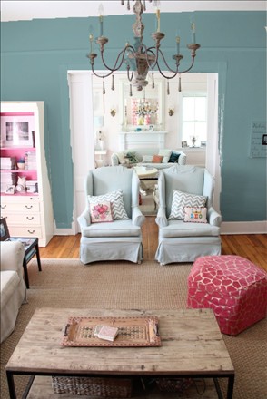

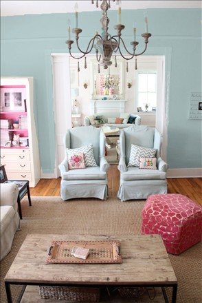
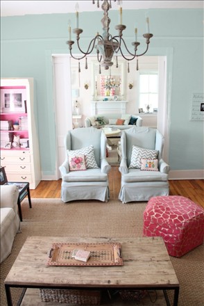
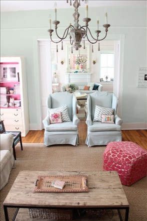

Does one jump out at you? This program was so helpful…for even though I know the colors are not exactly 100% accurate computer screen to wall…you still get a good glimpse at which colors have more green…more gray…are darker…bluer…brighter…and that helps enormously!
MY FRIEND LISA MENDE ALSO TOLD ME OF A SHERWIN WILLIAMS COLOR CALLED “RAINWASHED” THAT I AM GOING TO SWING BY AND GET A SAMPLE OF TODAY…
SEE YOU TOMORROW!XO

Williamsburg wythe blue
I actually LOVE this one..and in fact yesterday was sure I would use it…then I just get worried that it could be too dark when all 4 walls are done…I do love it though…thanks for the input!
I believe the Gossamer is speaking to me…….tough call……..lots of beautiful colors!
love gossamer…for me it is a toss up between gossamer and annapolois green…but I have a feeling I should go more pale/grayed down for that large of a space…thanks sheliayou will have to come by and see it when I finish!
The lighter shades grab me. How about you? I love the depth of Silver Lake. Apparently there’s a Silver Lake here in Oregon, Home of the Cowboys! Who knew? Did you happen to see Benjamin Moore’s In Your Eyes? It’s serene seaside with a splash of Peter Gabriel and John Cusack!
I love In Your Eyes, but on the wall it was too blue…pale blue…with not enough green…I will have to find another room for it!!!It would be so pretty on my porch!
ha! so easy for us to choose. It’s a different matter when it’s for my own room. Commitment issues : )
Silver Crest and Silver Lake ? maybe? you can’t go wrong with any of your selections – so beautiful.
Deb
Thanks Deb…it is so hard..and I guess part of the reason I have not changed the color in 6 years!
Palace Pearl and Annapolis Green were both my favorites.
If you are going to try rainwashed, you might want to try sea salt too. I have both in my home. They are beautiful colors, very close, one is just a tad greener.
Without question, Williamsburg Wythe Blue. I think the depth of the color will highlight all of the airy pieces you have in that space. I don’t think it will overpower anything, I think it will give everything else more substance.
As I was scrolling and before I got to the bottom of the picture I said “love that one!” and it turned out to be Palladian Blue which happens to be the color of our bedroom and master bath vanity. Too funny how without even knowing the name I knew I liked that one the best. Guess I picked the right one for my house!
I like the Gossamer and Wyeth blue just because it gives a little more contrast. The lighter colors and the blue chairs and accessories seem to blend in together. If you go with the lighter colors, you will need more pink accessories! :-). The House of Turquoise blog today has some SW colors on there you may like.
I like the way your hot pink pops against the darker tones but I am a sucker for light walls with white furniture… glass slipper for me. We painted our living room a couple weeks ago. A Lowes color called Silver Spoon… about half way through my husband says “does the room look purple to you?” Ugh. It was supposed to be a nice light grey to offset the blue kitchen. I’m not repainting anytime soon. It’ll have to do.
Silver Lake, Silver Crest and Annapolis Green stood wee my favorites!
Oops! What I meant to say was that Silver Lake, Silver Crest and Annapolis Green are my favorites. My clumsy fingers got in the way.
I like Silver Lake or Wythe Blue. Can’t wait to see the final results! 🙂
I love the Williamsburg Wythe Blue and the Gossamer blue…I prefer the more saturated colors. They are all pretty, you just can’t go wrong.!
I just got caught up on 2 months worth of posts and am loving all of the colors you’ve blogged! The Wythe Blue is gorge. Thank you for putting so much time into posting all of the wonderful colors…have used your posts to pick out the yellow for the body of my house, the grey for the shutters and the navy blue for the front door. 🙂
Wow all are so pretty! I was really drawn to Silver Lake. So soft!
Hey Lesli, after seeing this room again, am wondering if you would like the Farrow & Ball color “borrowed light” it is a very soft blue green which i love. I have used it on ceilings before to mimic the sky and it is soft and lovely. Thanks for the shout out. Another trick I tell clients when they question one of my color choices, is to go to Pinterest and enter the company & color name and all kinds of rooms painted in the color will pop up. You can tell quickly if it is the wrong shade or too dark or light. Good luck!
Glacier Lake or Williamsburg Wythe. I love how they bring out the other colors in the room.
Glass Slipper. Totally. So many of the others read really, really green!
I really like the deeper color of Williamsburg Wythe Blue – with your high ceilings, it’s intense without being too dark!
I came upon your blog today and was so refreshed to see someone who loves decorating in pink and blue (the softer shades) as much as I do. I have stuck with these colors for 30 years and have never tired with them. I often think of changing colors and when I visit other homes, i.e., models, friends, etc., I am always pleased when I walk in my front door and the thought goes away. I see other decors that I think are lovely, but none make me feel as comfortable and my pastels.
I love Palace Pearl!! Can’t wait to see what you choose 🙂
Not an easy decision, but I really like Silver Lake & Silver Crest.
Wickham Gray or Williamsburg Wythe! Love them both & actually came to your sure because I’m looking for an accent wall color in my living room & Wiliamsburg Wythe jumped out at me! Good luck. Picking paint makes me dizzy!!