NOW WHERE WERE WE?
AH YES..Lets talk about BLUE..
While I ADORE PINK…
BLUE is the color I have had in every single home I have lived.
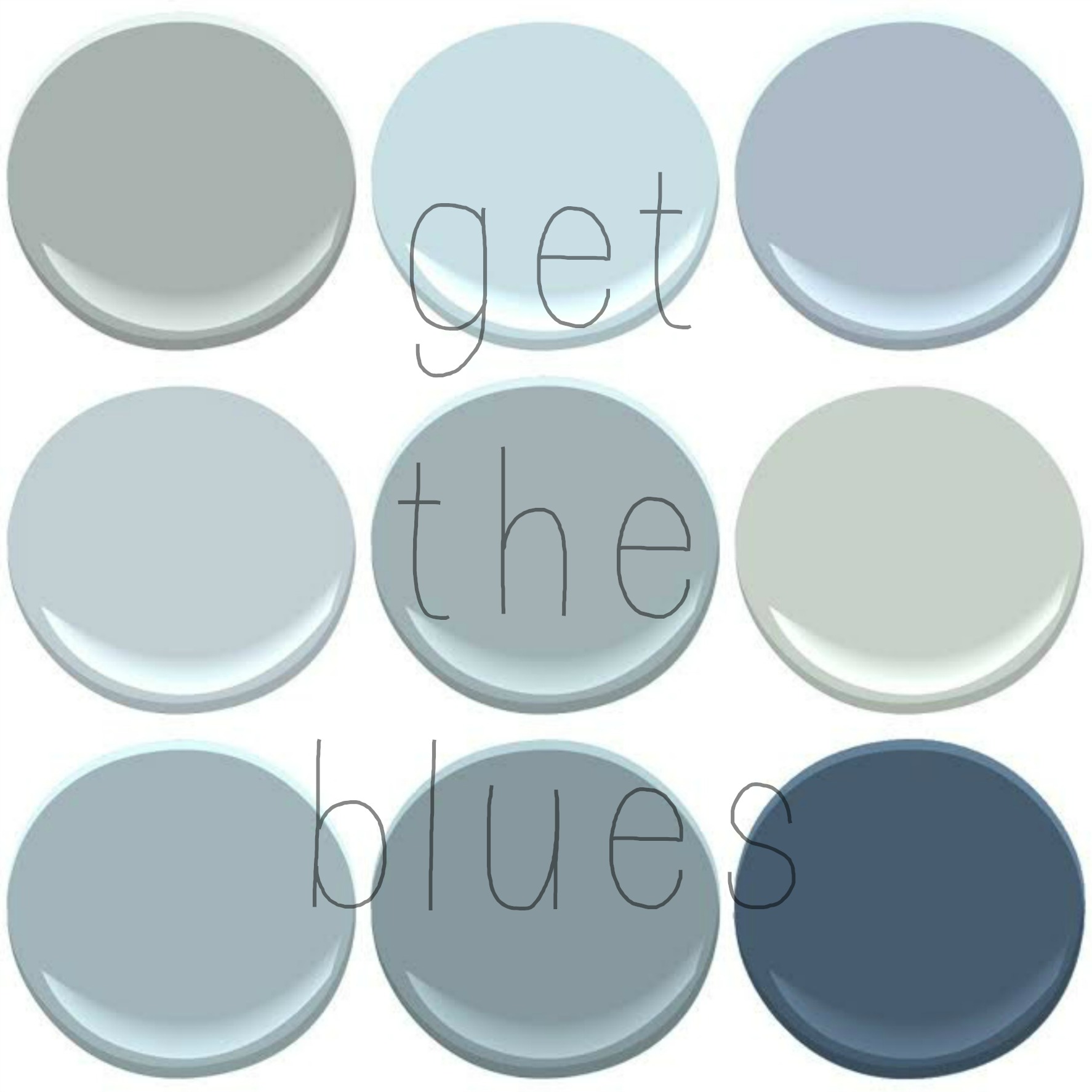
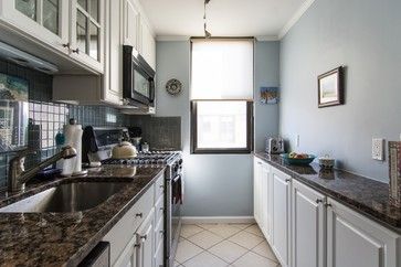
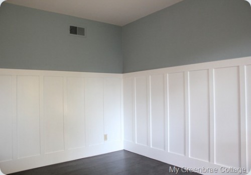
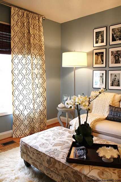
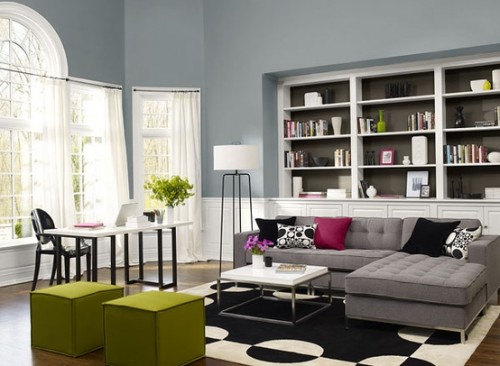
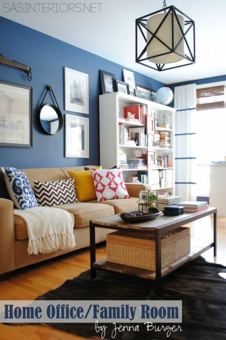
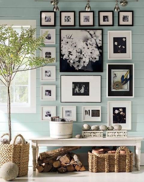
These are the Top selling Benjamin Moore Blues...I think one day I will have a home of all blues and whites and sort pinks…I could never tire of these colors…


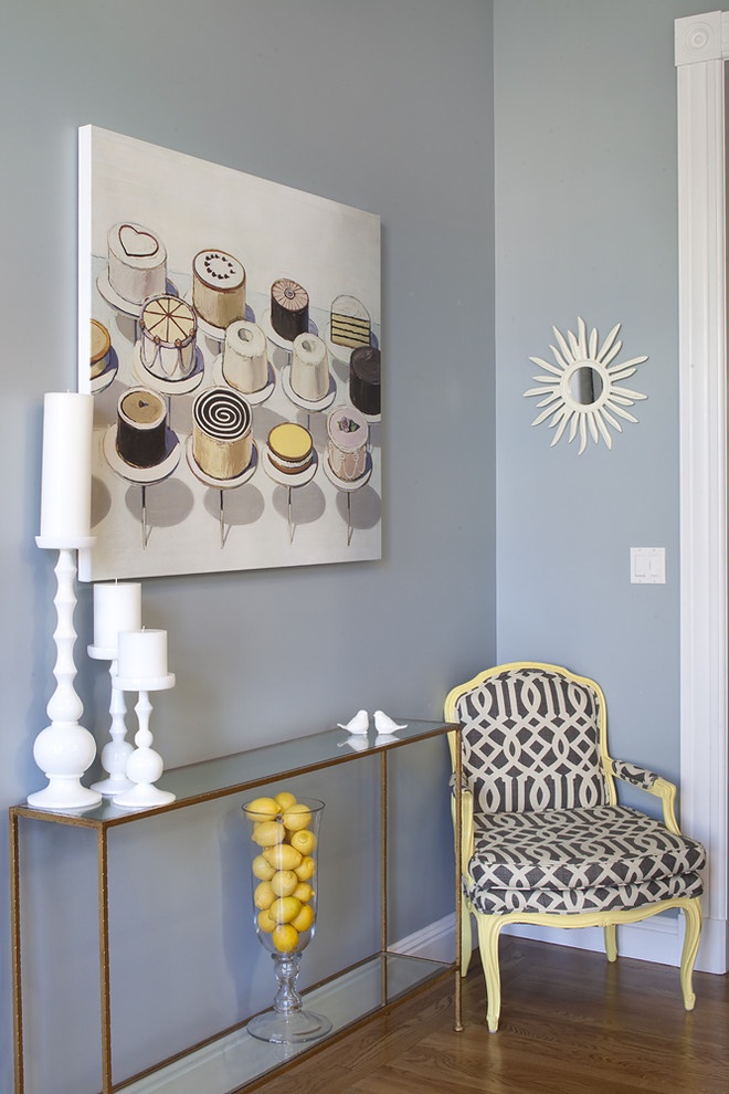


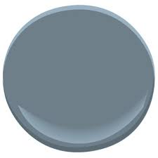
- SANTORINI


AND LASTLY ….
DON’T YOU JUST LOVE THESE BLUES???
WHICH IS YOUR FAVORITE? HAVE YOU USED ANY OF THESE COLORS?
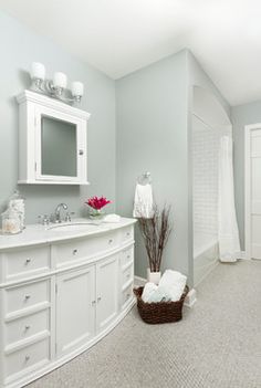
I have not used any of those blues yet, but am considering Mt Rainer Gray for our master bath. Our bedroom is BM Silver Cloud, which shifts from an ethereal light blue to gray/silver as the light changes during the day. Mt Rainer Gray is next to Silver Cloud on the paint color strip.
I could see that being great in a bath, especially if there is lots of white to pop!
Just love breath of fresh air! My favorite for sure!
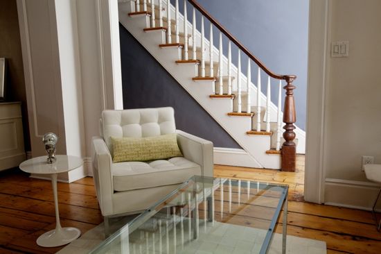
I was thinking about Breath of Fresh Air for the living room..so pretty…pretty pretty pretty!
My living room is painted in Benjamin Moore’s Watercolour & it looks a lot like Breath of Fresh Air…..and I love it!
It sounds beautiful!
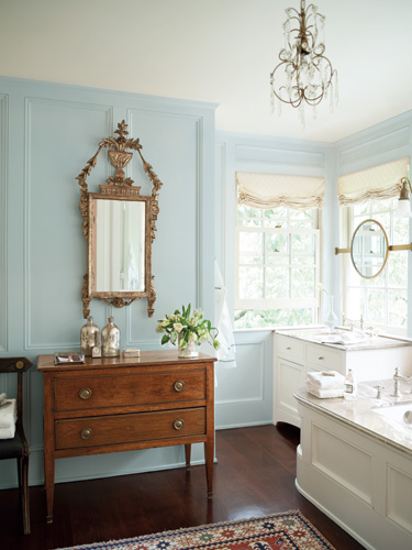
After seeing beautiful Ocean Air in your laundry room I used it in my bathroom. I love it. It is one of the prettiest blues. It’s light and clean but it never gets cloying or babyish. I started with Ben Moore’s Buxton Blue in my living room. The color is great but I learned it’s hard to decorate around a strong color. It’s beautiful but it really calls for some natural wood and plants to balance it’s depth. I never really decorated around it and it started to feel to heavy.
I decided to find an aqua I liked. I ended up painting one wall with Palladian Blue at 50%. It’s stunning…beautiful…it should win a prize, but I can’t bring myself to paint the whole room that color. I think I’ve learned that sometimes your favorite color is better as an accent.
I’m currently looking at some of the classic neutrals – revere pewter, edgecomb gray, stonington gray, maybe even white dove. I’m also waiting to see what Sea Salt looks like on your walls! It’s greener than I’d like, but I love that you said it reads as a neutral!
xo
Annie
Your experience with Buxton is why I stayed light with my light walls and chose with Sea Salt. This is how I look at it…a VERY light or a very dark color can act like a neutral because they do not compete with any colors…they provide contrast and highlights…but those colors in the middle of the strips, the Buxtons and the middle range COLORS…well, those ARE the stars and then you keep your furnishings simple and they support the color. Some people have been very successful with big color on walls and in the room, but for me it makes me anxious like all of the clothes are not in the drawers and the dishes are dirty and it is just TOO TOO MUCH…I need peace in my home because my life is anything BUT….!!!!
Competition is the problem! I’ve never looked at it that way, but you’re right, the colors in the middle become the stars. I’m really craving a very light color now. I think your home is a perfect example of how light colors can be a calm backdrop to other beautiful color mixes. Granted, you’re an incredible artist with an amazing sense of color! There’s such a sense of color rhythm in your rooms. I patiently await Sea Salt. 🙂
this is an old feed but wondering if you would either use van deusen blue or van Cortland in a dining room- north facing room?
No worries, everything that is on my feed is current to me! Those two colors are as different as night and day! One is a muted Navy, which will probably lean more towards a deeper navy blue done on all walls of a room and the other is a very gray blue green? The van Cort will be cooler….the other darker…what is your furniture like. I think the Van Deusen will be less traditional looking in a dining room. But these are all just MY opinions and I don’t make strict recommendations unless I have been hired to do so or can see the room in person…just too many variables. I will say this – the BM Historic colors are almost always winners in my book – they are classic and timeless.
Any suggestions for a periwinkle on the blue rather than lavender side. Thinking of November skies ?