- Last Month..has it been a MONTH already!!!
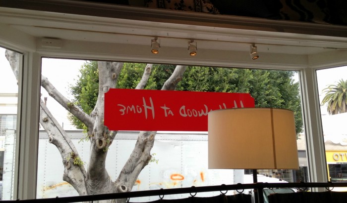
- I was in LA, and I visited a store called
- “HOLLYWOOD AT HOME”,
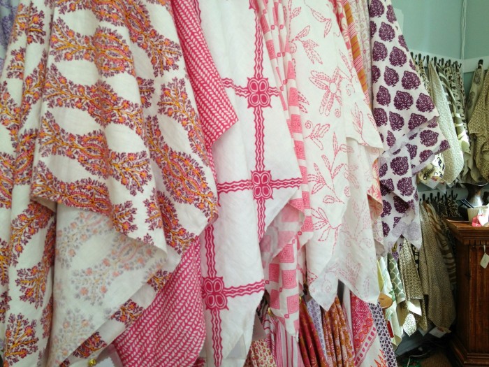
- You know, I was the one running from fabric to fabric crying out “Oh My God! Oh My God! WHAT is happening???”.
Interior Designer, Peter Durham, has GATHERED together collections from like tasted individuals AND DESIGNERS: JOHN ROBSHAW, CAROLINA IRVING, LISA FINE, ELIZABETH HAMILTON, RP MILLER mixing colors and textiles in an easy, world traveled and yet very down home kind of way. All I know is, I felt very
“AT HOME IN HOLLYWOOD AT HOME”!!!
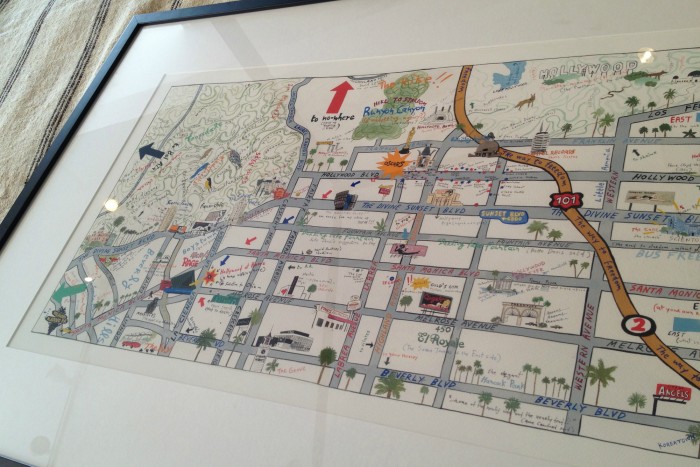 I wanted this SO bad! It is a “Star Map” by Artist Konstantin Kakanias, especially made for Hollywood at Home and available in two sizes, with and without frame.
Do yourself a favor, click HERE and check out his work, you will leave with a smile on your face!
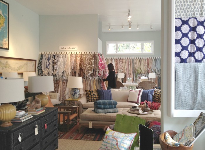
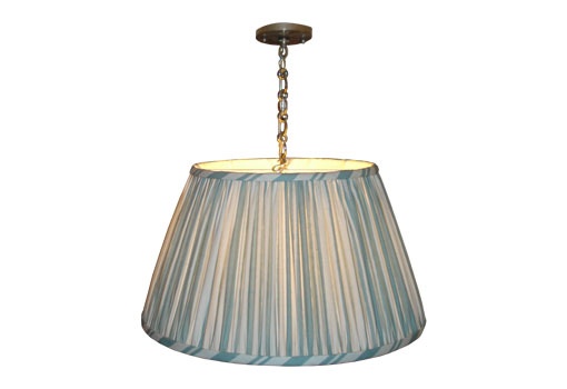
I asked the lovely, and very patient and very hip and definitely from LA girl that worked there…”What color is this?” (in my mind, I guessed “Gossamer Blue”and she said …”Palladian Blue”. and I thought ” Of course it is!!!!”
See, Palladian Blue and I have gone a few rounds. Like one of those relationships that you keep trying, only to find out, in the end, something is missing. JUST I will take time off, go back…same thing.
The lighting is perfect in Hollywood at Home and I honestly cannot think of a better color than Palladian Blue to showcase the beauty which lives there. 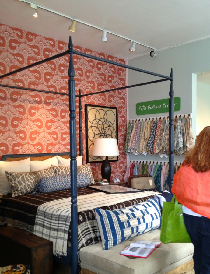 I absolutely adore the combination of the Palladian Blue, almost using it as a Neutral color …. with the fabric covered wall…unexpected…and of course that is what seals the deal for me…I love surprises!
so…..you might be seeing some Palladian Blue in my house soon…turns out, the Master Bathroom gets beautiful Light!!!! FINALLY we are BACK TOGETHER!!! and THIS TIME…IT WILL BE FOR KEEPS!!!!
I had Palladian Blue in the master bedroom of our previous house. It is such a pretty color. It does need a lot of light. That last picture of the orange blue and brown bedroom is YUMMY! I would have been drooling in that shop too.
Hi Lesli –
Great post! Love the Palladian Blue – as a matter of fact I am using it for a nursery I am currently working on. It’s just one of those few colors that can be used almost anywhere and look fabulous. Can’t wait to hook up with you again in less than two weeks! Be well.
Jeanne
[…] Hollywood at Home […]