MY NUMBER MOST PINNED PHOTO FOR MONTHS IS:
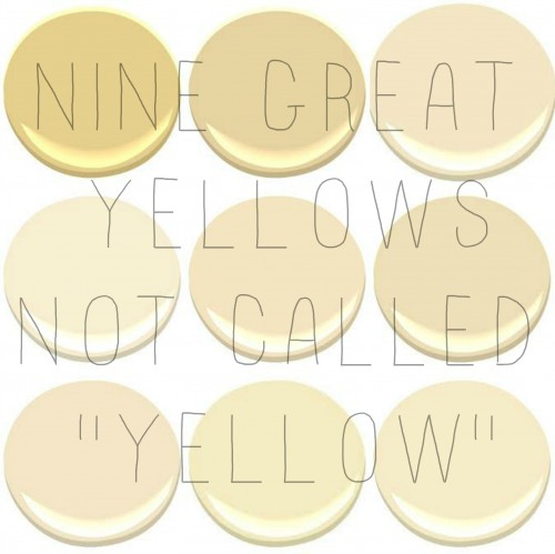
YELLOW is my husbands favorite color….AND YELLOW IS TRICKY!
Our very first home was a sweet small brick home, with low ceilings and little light in the hallways. I wanted to brighten the main hallways and chose a pale yellow. The color was called…”Yellow” something…maybe “Spring YELLOW”, I can’t remember….I wanted a nice light creamy yellow and that is how it looked on the card. I was so certain it was perfect that I did not even feel the need to put a tester swatch on the wall (BIG..BIG… MISTAKE). I could not wait to come home and see the beautiful hallway inspired by this English Countryside Inn .
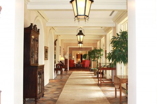
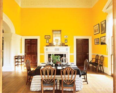
Unfortunately I walked in and was slapped in the face with a LEMON……It was so bright I needed sunglasses (maybe I am exaggerating a tad). We are not talking a deep rich gorgeous yellow like the beautiful MONTICELLO CHROME YELLOW which I adore…..
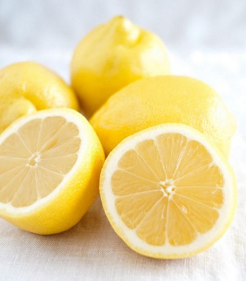
…but no, OUR HALLWAY was like the inside of a lemon.
We repainted immediately.
I learned a valuable lesson …and that was that MOST TIMELESS interior YELLOWS ….are actually…
NOT CALLED YELLOW AT ALL!
.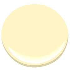
- HAWTHORNE YELLOW
Of the 10 best selling yellows that Benjamin Moore sells…only one, Hawthorne Yellow uses the word
“YELLOW” in its’ name.
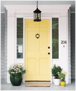
THE Remaining 9 are all beautiful ….

…but NOT called YELLOW. I learned that the yellow colors I like need to almost look creamy whitish in the can…then on the wall they translate to that lovely creamy yellow I wanted… LETS TAKE A LOOK….
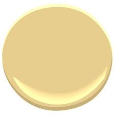
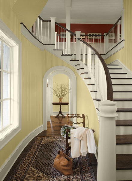
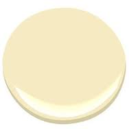
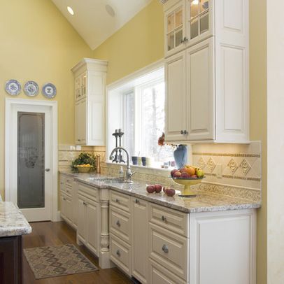
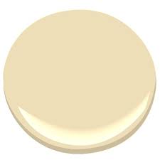
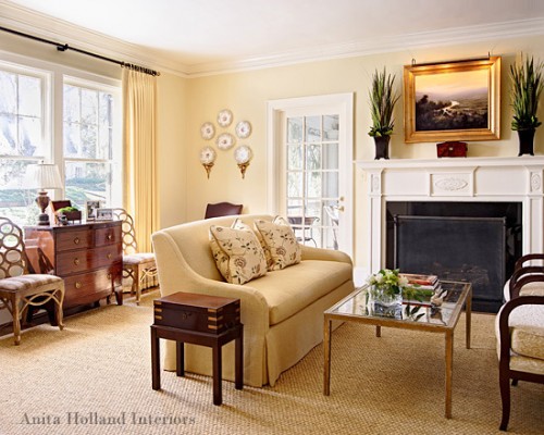
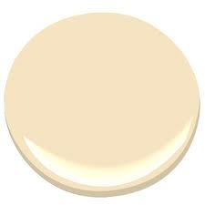
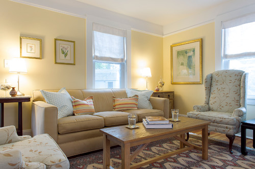
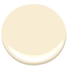
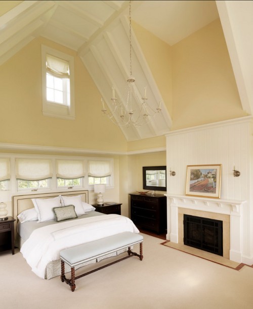
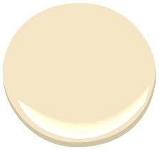
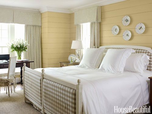
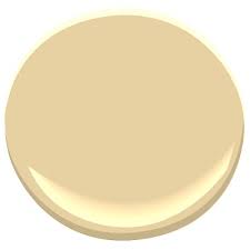
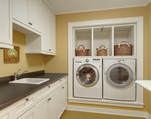
AND MY TWO PERSONAL FAVORITES….RICH CREAM AND WINDHAM CREAM
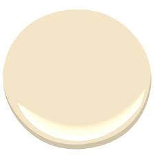
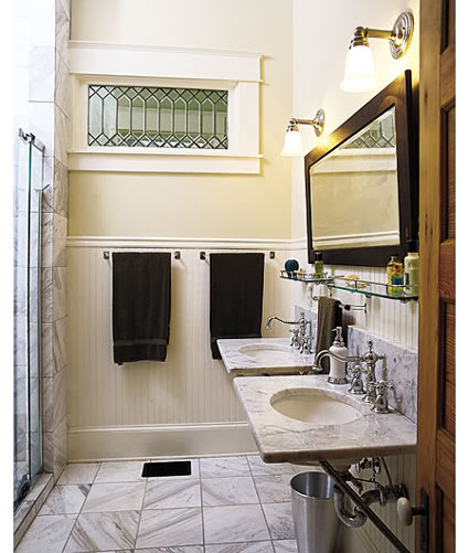

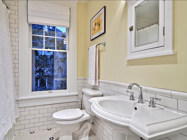

….our living room is painted a color with a golden undertone, very subtle but lovely…

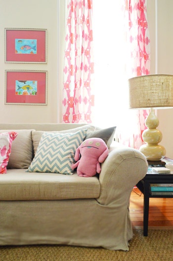
ALL of these “YELLOWS” are timeless.
AND VERSATILE. They look great when paired with pale blues, sort reds, greens, pinks, gray and even Black……they are warm and inviting and relaxing and cozy and can be appropriate for nearly all styles…be it ….
Mid-Century Modern or Vintage or Cottage or Country or Arts and Crafts, Colonial Revival.
DO YOU HAVE A FAVORITE “GO TO” INTERIOR YELLOW???
and…have you ever had a yellow mishap?
Hello, I personally love, love, yellow! I’m with your husband, my fav too! I grew up with yellow, it was also my Mom’s fav color. And she did it well! I believe I got my interior design talent from her, our home was beautiful! She didn’t really know she had a knack for it, at least we never talked about it, I lost her when I was 26 years old, she was much too young to go. But, I carry on the yellow tradition in her honor. I love your blog and have been a reader for awhile now. Great post on yellows, thanks. They are a bit tricky, but as you know, even if it’s a touch off in a room, we are relentless to get it right, right?
Cathy 🙂
Yellow works that is all there is to it! It just works! Thanks
You had me at Concord Ivory! We moved into a newly built farmhouse style home in New England in 1996, and chose Concord Ivory for the exterior clapboards. (All the other homes on the street were shades of beige, grey and taupe— we looked like sunshine among the storm clouds!) I loved it so much, we also painted the front hallways, upstairs and downstairs, in it as well. Sunny and cheerful even in the winter, but has enough of a muddiness to keep it from being “lemony”. When we moved to VA nine years ago, I had the living room painted the same, as I missed it so much. It pairs beautifully with everything; I especially love it with blues and black.
Concord Ivory was my “go to” gold/yellow for years! Such a rich color!
We did exactly the same – people actually stop by to say the house makes them smile . Siding is Concord Ivory, trim is Weston Flax, doors are Laguna Blue…
Windham Cream is the color that we have in all of the continuous spaces in our house. The foyer, stair hall, upstairs landing, dining room, and kitchen all flow into each other and needed to be the same color … and Windham Cream is totally perfect for the light in this house. Our last house’s yellow was called something like Filtered Light. Perfect for that house, too washed out for this one (I swatch tested it before I committed, thank goodness).
I would add Farrow and Ball’s ‘Tallow’ to this list. It’s got a beautiful golden glow that I love.
This is actually a very good tip to know about yellow. I’m glad to now know that if I want the timeless yellow to not go after paints with the name yellow in it, execpt for Hawthorne Yellow. Thanks!
I recently used Benjamin Moore Lemon Ice for the walls of a kitchen with BM Sapphire Blue cabinets. The yellow was bright and cheerful like a sunshiny morning without being too “in your face”. It looked very Cream when going up, but dried to the perfect chipper hue.
I had perfect yellow bedroom walls when I was young, but no idea what paint or color that was. In an attempt to get that feeling again I painted a kitchenette in what I hoped would be a soft butter yellow, and it looked great going up, but when it dried it was very bold. With proper accessorizing it turned out looking intentional, but it was not what I had hoped.
I’m now searching for the right yellow for my new kitchen with BM Aberdeen Green cabinets. I’m really liking the looks of Montgomery White… may get a sample of that tomorrow!
I am going to have to check out Lemon Ice!!! Good lucky with Monthgomery white! Also while you are at it, check out “WHITE ROCK” ..LOVELY VERY PALE YELLOW
Yellows are the most difficult Colours to work with. You have to understand that the floor Colour governs how the yellow will look. Also the light from outside – a green lawn will throw off the yellow. If you use cheap paint the yellows will turn greenish/lemony. Always paint the walls first with the correct undercoat which bleeds through.
The bigger the room the stronger you should go. The more light from high windows the more the yellow will bleach out. Yellow will look quite different in the morning (cooler) than the afternoon. Always paint the darkest corner walls in the room to get the correct reading of how the Colour will look.
I love reading all your great information! Especially about yellow! I am in a small condo with low light. I have Hepplewhite Ivory as my trim and doors and did Powell Buff as my wall color. The Powell Buff is too dark and looks a little green. Couldn’t understand why…until I read your posts. Now I am looking for a new wall color to go with Hepplewhite Ivory.
Thanks again.
I love that color. Thanks and good luck!
After years of looking as basic beige on the exterior of our house, I finally convinced the ‘lord and master’ that it needed to be yellow with white trim. I bought several samples of different shades of yellow and always added a small amount of white to it. I finally managed to mix my own color that turned out pretty nice. Did the white trim and a coral colored front door! Love my yellow house!!
Wow – good for you. And you got lucky because what I learned the hard way is that adding white to a color often does not lighten as much as muddy and flatten out the hue. Those colors sound really pretty together.