I USED TO THINK THAT ANY “NON COLOR” WAS BORING. Then I started to accumulate THINGS – like furniture, lamps, rugs and accessories and I began to lean more toward a more neutral wall to allow all of the color in my “THINGS” to pop!
![LIVING ROOM PAINTED STEAMED MILK](http://myoldcountryhouse.com/wp-content/uploads/2016/06/LesliHouse0067-599x900.jpg)
This NEW way of decorating (for me ANYWAY) – opened up the world of possibilities. No longer MY WORLD was a limited by color choices…and no longer was I RE painting my walls EVERY year. It was easier and more cost effective to swap out “THINGS” seasonally or when I grew bored of them, than to RE paint ALL the walls.
![BOYS ROOM in the 2015 Southern Living Idea House - steamed milk](http://myoldcountryhouse.com/wp-content/uploads/2015/12/BOYS-ROOM-1-600x900.jpg)
BASICALLY – I fell in LOVE with……
“NEUTRALS”
![ALL BENJAMIN MOORE COLORS: 1. ASHWOOD, 2. CREAMY WHITE (AKA SPRING IN ASPEN), 3. EDGECOMB GRAY, 4.FEATHER DOWN, 5. FRENCH CANVAS, 6. LANCASTER WHITEWASH, 7. MARITIME WHITE, 8. OLD PRARIE, 9. SAILCLOTH](http://myoldcountryhouse.com/wp-content/uploads/2013/10/7bestneutrals1-500x500.jpg)
AND
![SHERWINN WILLIAMS STEAMED MILK](http://myoldcountryhouse.com/wp-content/uploads/2016/01/STEAMED-MILKW.png)
STEAMED MILK (SHERWINN WILLIAMS)
YES, I know, these colors, in this configuration, look almost identical.
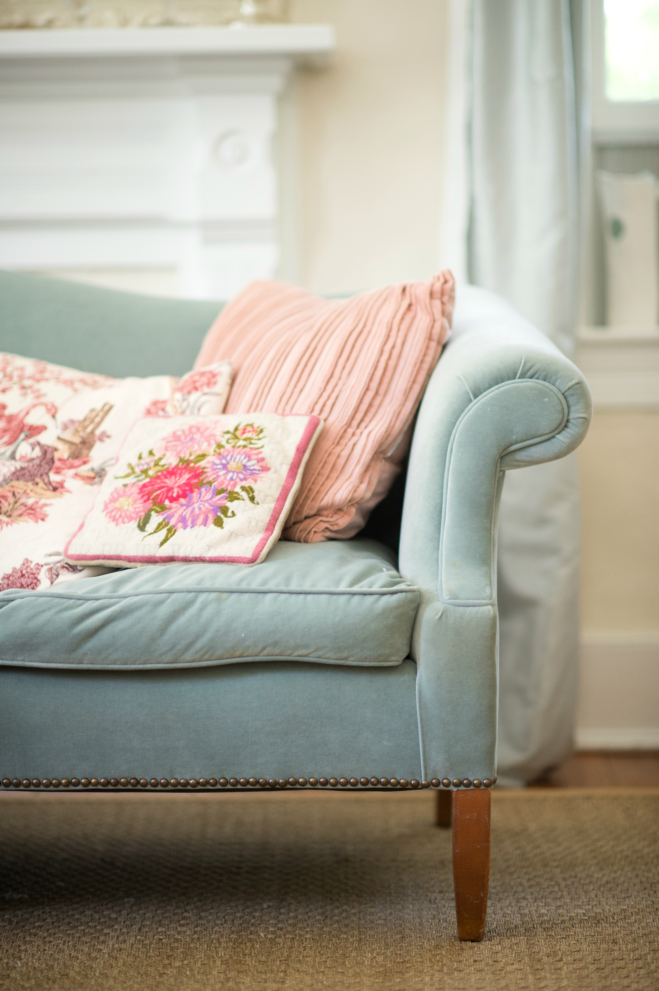
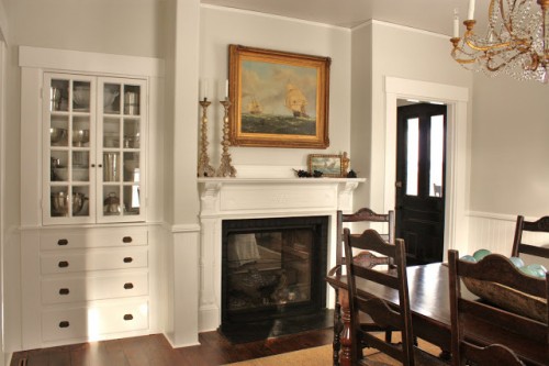
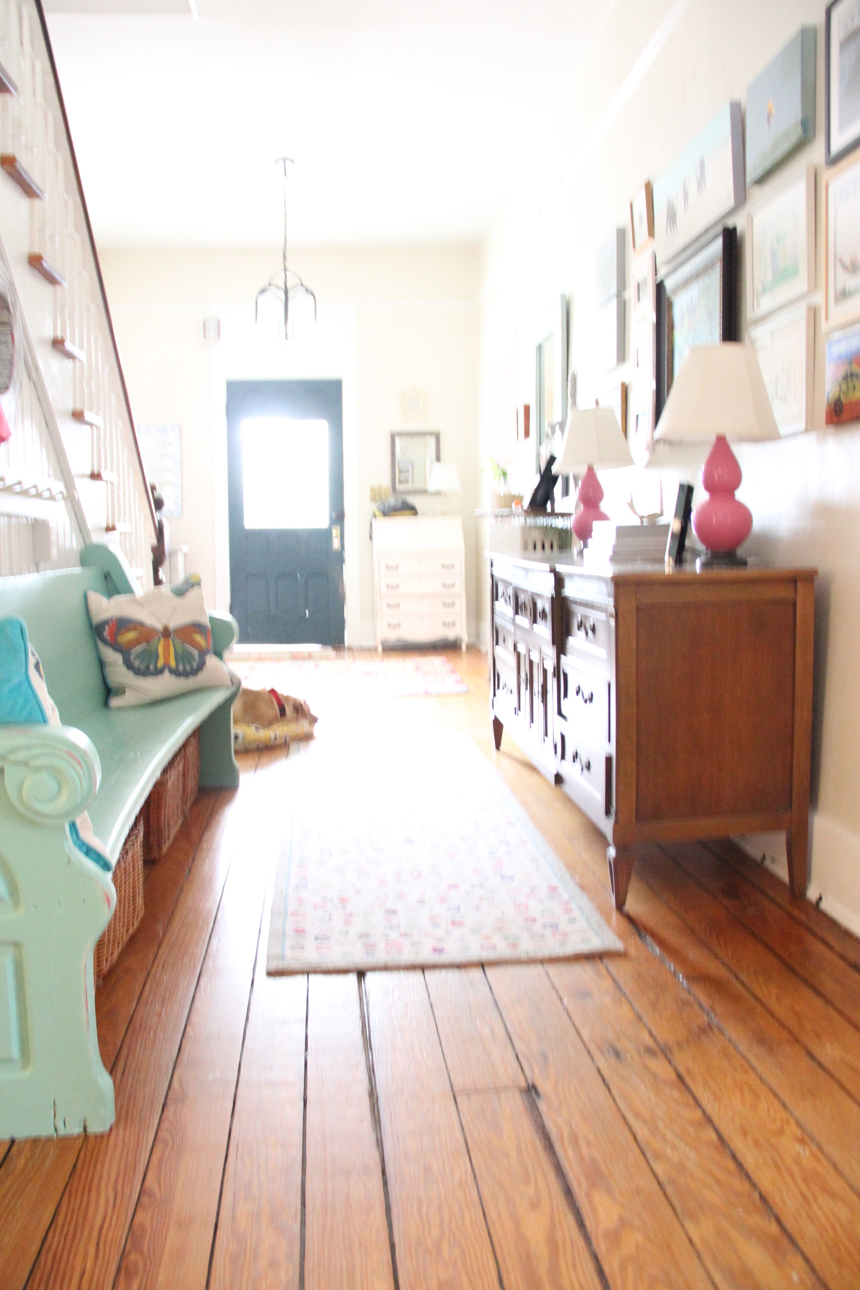
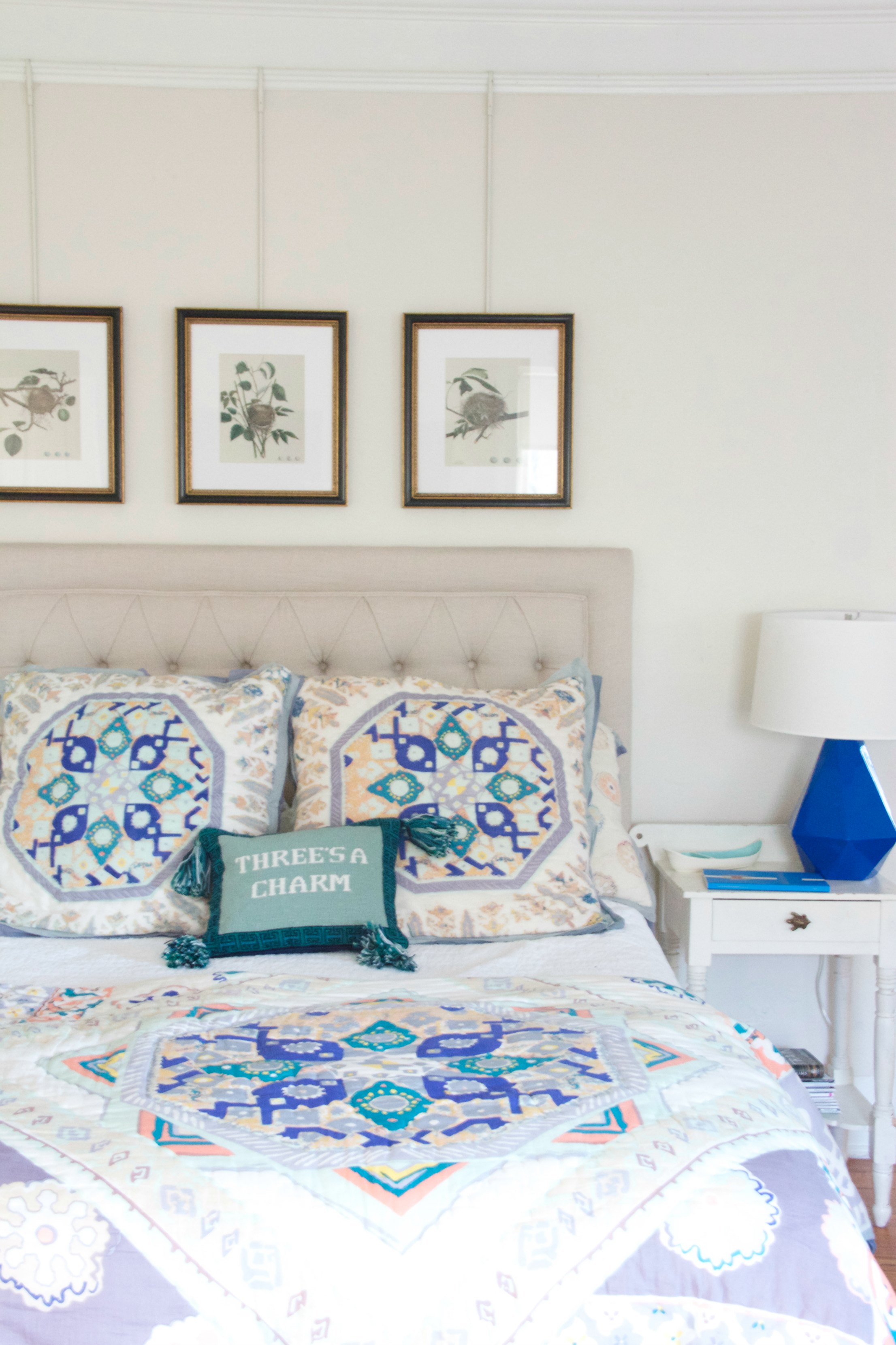
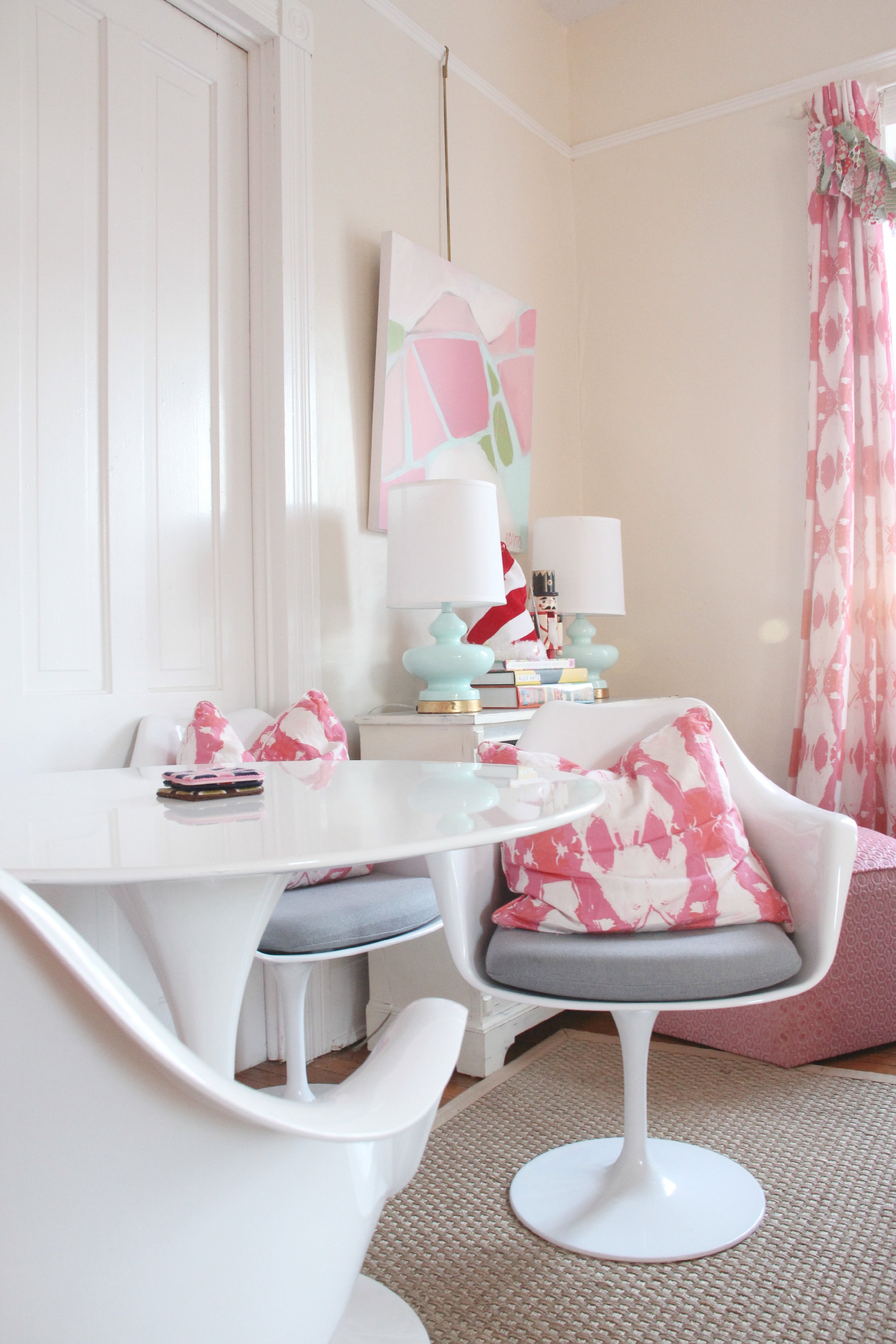
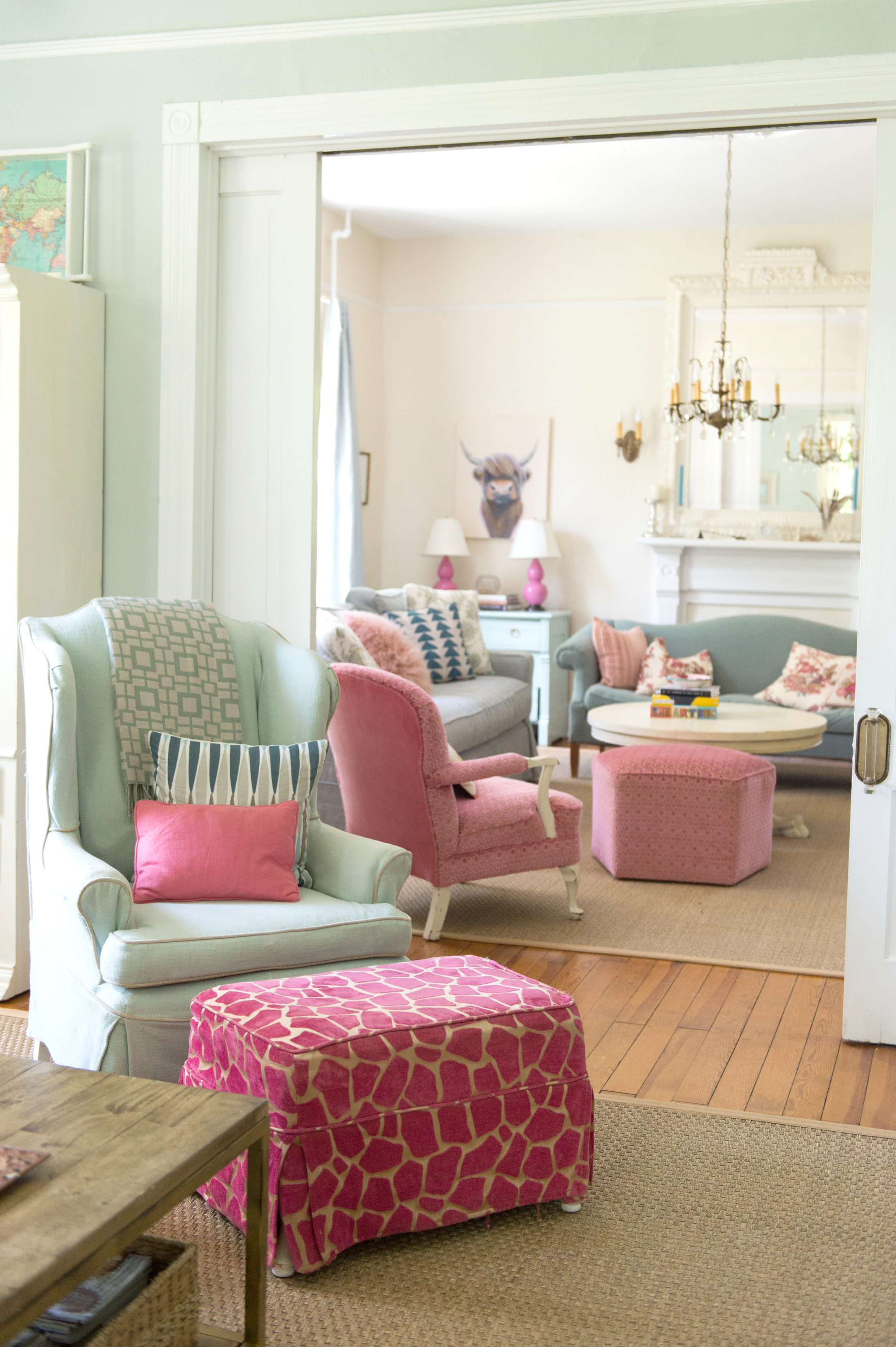
In real life they are each unique, with subtle and non intrusive undertones …These 10 colors are my favorite “Neutrals”. Do not be fooled, some have the word “white” in their name BUT they are NOT whites. They are all BUT ONE Benjamin Moore Colors, I tend to stick with what I know and what works…time and time again. I have used 7 of these colors in my current home. Ashwood – Dining Room, Feather Down – Entryway, Creamy White/ Spring in Aspen – Living Room, Maritime White – Upstairs hall, Edgecomb Gray – the Sleeping Porch AND Titanium – Dining Room table.
They are not for everyone…but they work great for me!
![ASHWOOD - MY OLD COUNTRY HOUSE DINING ROOM](http://myoldcountryhouse.com/wp-content/uploads/2013/10/ashwood.jpeg)
![ASHWOOD - FOR THE LOVE OF A HOUSE](http://myoldcountryhouse.com/wp-content/uploads/2013/10/IMG_3287.jpg)
![BENJAMIN MOORE ASHWOOD - FOR THE LOVE OF A HOUSE](http://myoldcountryhouse.com/wp-content/uploads/2016/12/bm-ashwood.jpg)
![FOR THE LOVE OF A HOUSE - ASHWOOD](http://myoldcountryhouse.com/wp-content/uploads/2012/04/IMG_2867-500x333.jpg)
![ASHWOOD - MY OLD COUNTRY HOUSE DINING ROOM](http://myoldcountryhouse.com/wp-content/uploads/2013/10/L1050315-500x375.jpg)
![CREAMY WHITE AKA SPRING IN ASPEN](http://myoldcountryhouse.com/wp-content/uploads/2013/10/creamywhiteakaspringinaspen.jpeg)
![MY OLD COUNTRY HOUSE LIVING ROOM CREAM WHITE AKA SPRING IN ASPEN](http://myoldcountryhouse.com/wp-content/uploads/2013/10/LIVINGRM2-600x900.jpg)
![SPRING IN ASPEN KATIE UKROPS HOUSE](http://myoldcountryhouse.com/wp-content/uploads/2013/10/living-room-parlor-domino-m.jpg)
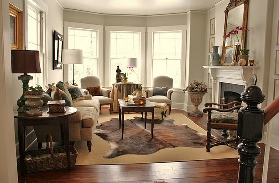
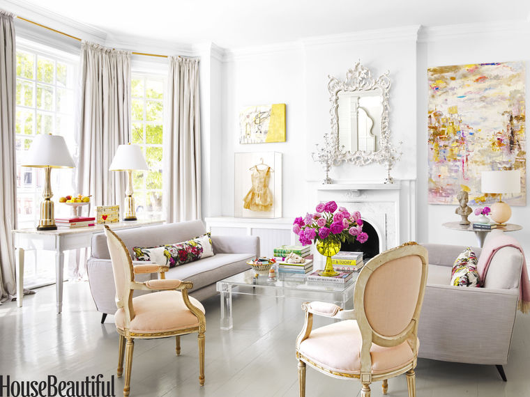
HEY, HERE IS A FUNNY ANECDOTE. The home of Katie Ukrops above was my inspriation for the colors I now use…and look at her home now – featured on the cover of House Beautiful this fall!!!
![http://www.housebeautiful.com - KATIE UKROPS LIVING ROOM 2016](http://myoldcountryhouse.com/wp-content/uploads/2016/08/57b376ee5f923.image_-700x525.jpg)
![KATIE UKROPS LIVING ROOM 2016](http://myoldcountryhouse.com/wp-content/uploads/2016/08/57b2206f9c1a1.image_.jpg)
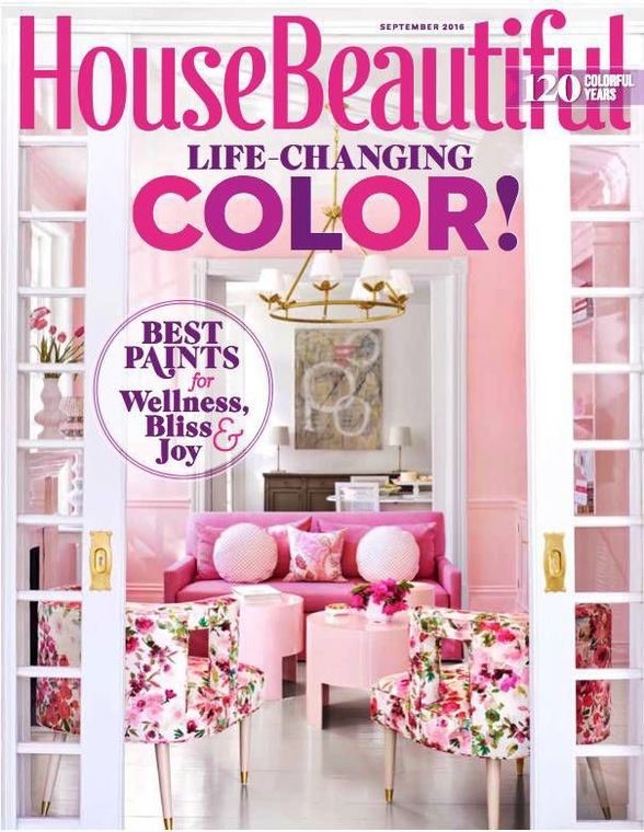
while this pink room above and the pink touches are what is featured…she still kept most rooms like this:
![KATIE UKROPS LIVING ROOM 2016](http://myoldcountryhouse.com/wp-content/uploads/2016/08/57b376edec00b.image_-700x525.jpg)
SO WHO KNOWS…NEXT HOUSE MAYBE? HA!
RIGHT NOW ANYWAY – NEUTRAL colors are the absolute perfect backdrop to the colors I use in my fabrics, art, lamps and accessories. They are like a good partner who complements your best traits…provides the necessary balance and lightness while letting you shine. All I know is that after what felt like a lifetime of changing colors every 8-12 months…I brought these colors into my home 10 years ago and I have NOT felt compelled to change my wall colors…nope, not yet.
![EDGECOMB GRAY](http://myoldcountryhouse.com/wp-content/uploads/2013/10/edgecombgray.jpeg)
![EDGECOMB GRAY FROM perfectly-imperfectlife blogspot.](http://myoldcountryhouse.com/wp-content/uploads/2013/10/edgecomb-gray-bm4-500x517.png)
![EDGECOMB GRAY - YOUR NEST DESIGN](http://myoldcountryhouse.com/wp-content/uploads/2016/12/bm-edgecomb-gray1.jpg)
![Justin Bernhaut for Domino via Flickr](http://myoldcountryhouse.com/wp-content/uploads/2013/10/ginaafter2_thumb1-500x375.jpg)
![TRADITIONAL HOME EDGECOMB GRAY](http://myoldcountryhouse.com/wp-content/uploads/2013/10/b3ba6d5a66d1739a8248b8d8038ca7c5.jpg)
EDGECOMB GRAY
![FEATHER DOWN](http://myoldcountryhouse.com/wp-content/uploads/2013/10/featherdown.jpeg)
![KATIE UKROPS ENTRYWAY FROM DAUGUST 2008 DOMINO MAGAZINE - FEATHER DOWN - this home inspired my move to neutrals and I have NEVER looked back...](http://myoldcountryhouse.com/wp-content/uploads/2013/10/eb3375cb932f0337f266330b1cfec82d.jpg)
![The Long View down the front hall](http://myoldcountryhouse.com/wp-content/uploads/IMG_4906-466x700.jpg)
![CREDENZA AND GALLERY WALL](http://myoldcountryhouse.com/wp-content/uploads/IMG_4884-466x700.jpg)
![FRENCH CANVAS](http://myoldcountryhouse.com/wp-content/uploads/2013/10/frenchcanvas.jpeg)
![FRENCH CANVAS -BEACH HOUSE IN THE CITY](http://myoldcountryhouse.com/wp-content/uploads/2013/10/masterafter3w-500x333.jpg)
![FRENCH CANVAS PINTEREST](http://myoldcountryhouse.com/wp-content/uploads/2013/10/c3de26cd14edb44b697c49cc9f63f3d2-500x666.jpg)
![FRENCH CANVAS - BEACH HOUSE IN THE CITY](http://myoldcountryhouse.com/wp-content/uploads/2013/10/masterafter2w.jpg)
![LANCASTER WHITEWASH](http://myoldcountryhouse.com/wp-content/uploads/2013/10/lancaster-Whitewash.jpeg)
![PINTEREST](http://myoldcountryhouse.com/wp-content/uploads/2013/10/198158452323900796_v5WzJ8Ld_c-500x330.jpg)
![MARITIME WHITE](http://myoldcountryhouse.com/wp-content/uploads/2013/10/maritimewhite.jpeg)
![MY OLD COUNTRY HOUSE UPSTAIRS HALLWAY MARITIME WHITE](http://myoldcountryhouse.com/wp-content/uploads/2013/10/HALL9-600x900-1-466x700.jpg)
![MARITIME WHITE](http://myoldcountryhouse.com/wp-content/uploads/2013/10/HALL6-600x900-466x700.jpg)
![HALL11-600x900](http://myoldcountryhouse.com/wp-content/uploads/2013/10/HALL11-600x900-466x700.jpg)
![OLD PRAIRE](http://myoldcountryhouse.com/wp-content/uploads/2013/10/oldpraire.jpeg)
![SOUTH SHORE REDECORATING OLD PRAIRIE](http://myoldcountryhouse.com/wp-content/uploads/2013/10/64169c79da9f.jpg)
![OLD PRAIRIE - DECORPAD](http://myoldcountryhouse.com/wp-content/uploads/2013/10/834cda1941b2-463x700.jpg)
![SAILCOTH](http://myoldcountryhouse.com/wp-content/uploads/2013/10/sailcoth.jpeg)
![PROJECT NURSERY SAILCLOTH](http://myoldcountryhouse.com/wp-content/uploads/2013/10/Nowell-Hoopers-Room-1-1024x708-500x399.jpg)
![SAILCLOTH - DECORPAD](http://myoldcountryhouse.com/wp-content/uploads/2013/10/b015b1500a9b-500x333.jpeg)
…..AND FINALLY STEAMED MILK – THIS COLOR WAS USED THROUGHOUT THE 2015 SOUTHERN LIVING IDEA HOUSE WHICH HAPPENED TO BE LOCATED A FEW MILES FROM MY HOME. I FELL IMMEDIATELY IN LOVE WITH IT AND PAINTED MUCH OF OUR HOUSE STEAMED MILK . I LOVE IT. IT IS WARM, LIGHT, CREAMY BUT NOT YELLOW AND NOT TOO GRAY….
![MASTER BEDROOM newly PAINTED STEAMED MILK](http://myoldcountryhouse.com/wp-content/uploads/2016/01/MASTER-600x900.jpg)
![steamed milk and Table and Chairs](http://myoldcountryhouse.com/wp-content/uploads/2015/12/a-table-and-chairs-600x900.jpg)
![LIVING ROOM PAINTED STEAMED MILK](http://myoldcountryhouse.com/wp-content/uploads/2016/06/LesliHouse0040-599x900.jpg)
![2015 SOUTHERN LIVING IDEA HOUSE, LIVING ROOM MANTLE](http://myoldcountryhouse.com/wp-content/uploads/2015/10/image10-e1445863618654-675x900.jpg)
There you go…my 10 favorite Neutrals AND STEAMED MILK!
Like I said, these color are not for everyone. But I think they dispel the myth that Neutrals are boring. I find these colors perfectly beautiful. And Versatile And flexible. They quite simply…JUST WORK!
Do you use any of these colors in your home?
xo lesli
Beautiful colors for a neutral pallet and I do love the Steamed Milk. I’m not one for all white so I’m thrilled that you shared these! In the next to last photo, showing your living room, the pink pattern of the ottoman is beautiful! Do you have a resource for it? Ii love the way you mix and match colors and patterns! I live in an apt and I’m really thinking of having my loveseat reupholstered and changing some colors.
Thanks again for sharing!
xo
Pat
Thank you Pat. The fabric in the foreground is a Giraffe Print velvet I got years ago. I am not sure where it is now. The other pink verlvet (chair and ottoman) I got a Mood. http://www.moodfabrics.com Good Luck!
Can you tell me the difference between Spring in Aspen and Maritime White. My eye doesn’t really see much difference with my samples. I’m trying to decide if either of these would work well on a living room wall that faces north. Living room has red oak floors with just the natural finish.
Maritime white is a lighter version of Spring in Aspen. so if you like one but have more or less light in a room you can decide accordingly. In addition, – If you have a living room (like me) that gets TONs of light and use SIA in there, and have Maritime in a darker hall (like me) – they will look nearly identical.