I am feeling the hint of Spring in the air…and just waiting for the first yellow forsythia to bloom.
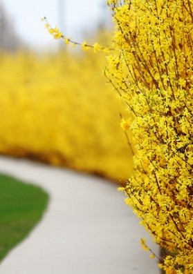
YELLOW is my husbands favorite color….
Our very first home was a sweet small brick home, with low ceilings and little light in the hallways. I wanted to brighten the main hallways and chose a pale yellow. The color was called…”Yellow” something…maybe “Spring YELLOW”, I can’t remember….I wanted a nice light creamy yellow and that is how it looked on the card. I was so certain it was perfect that I did not even feel the need to put a tester swatch on the wall (BIG..BIG… MISTAKE). I could not wait to come home and see the beautiful hallway inspired by this English Countryside Inn .
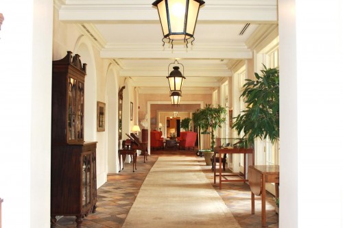
Unfortunately I walked in and was slapped in the face with a LEMON……It was so bright I needed sunglasses (maybe I am exaggerating a tad). We are not talking a deep rich gorgeous yellow like the beautiful MONTICELLO CHROME YELLOW which I adore…..
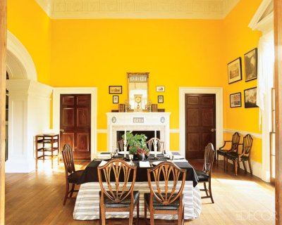
…but no, OUR HALLWAY was like the inside of a lemon.
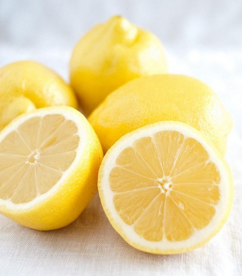
We repainted immediately.
I learned a valuable lesson …and that was that MOST TIMELESS interior YELLOWS ….are actually…
NOT CALLED YELLOW AT ALL!
.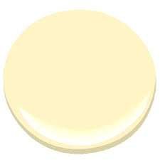
- HAWTHORNE YELLOW
Of the 10 best selling yellows that Benjamin Moore sells…only one, Hawthorne Yellow uses the word
“YELLOW” in its’ name.
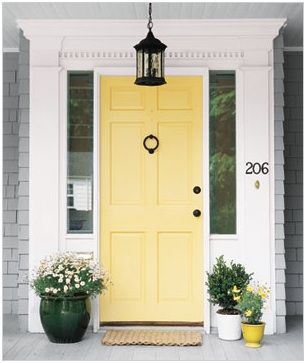
THE Remaining 9 are all beautiful ….
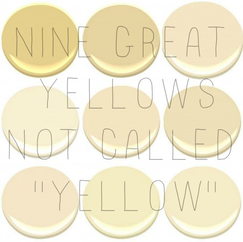
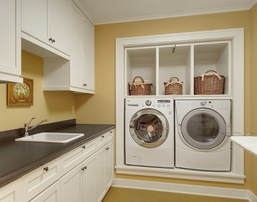
…but NOT called YELLOW. I learned that the yellow colors I like need to almost look creamy whitish in the can…then on the wall they translate to that lovely creamy yellow I wanted… LETS TAKE A LOOK….
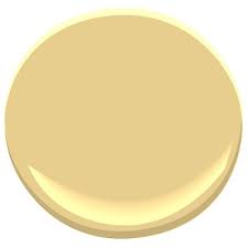
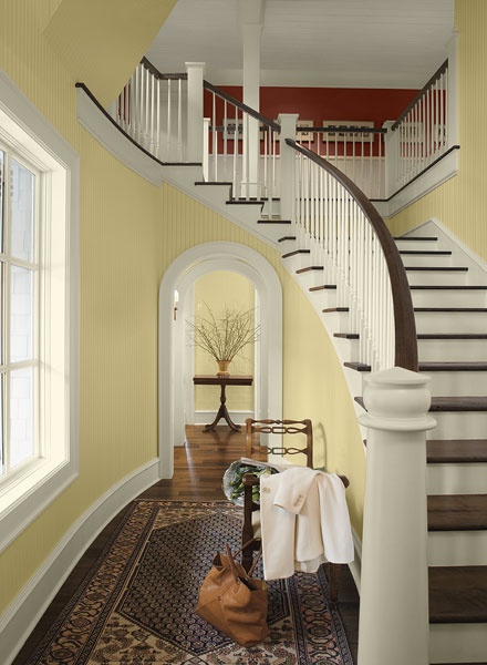
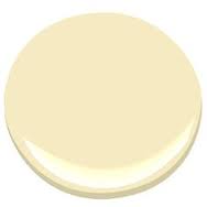
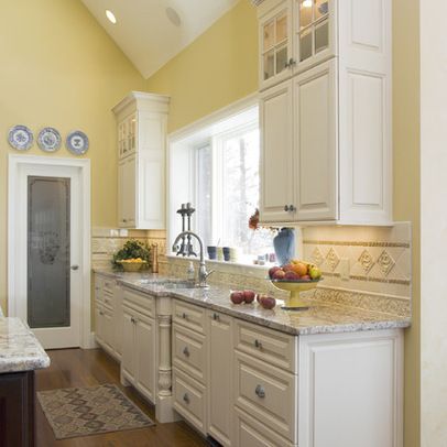
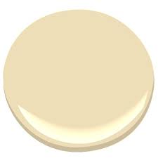
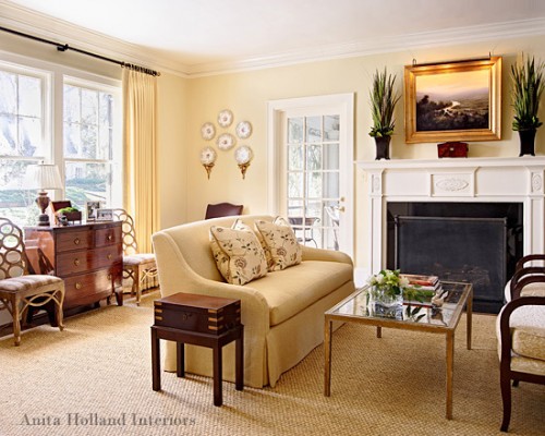
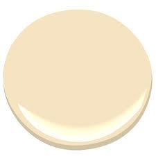
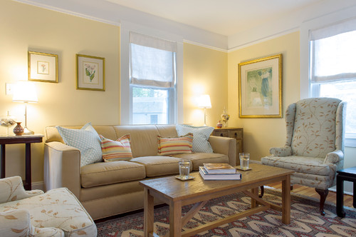
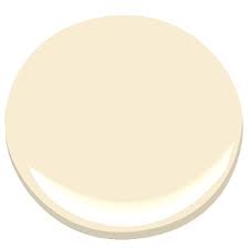
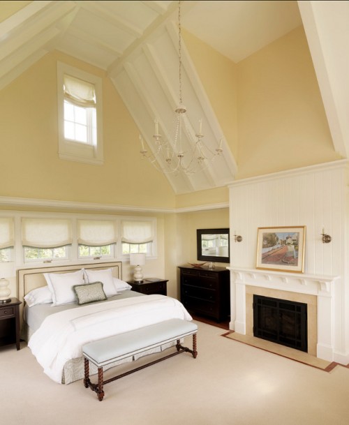
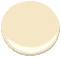
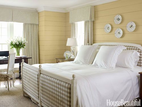
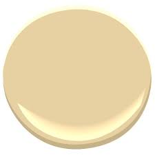
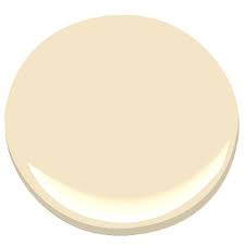
AND MY TWO PERSONAL FAVORITES….RICH CREAM AND WINDHAM CREAM
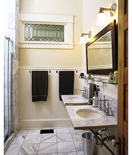

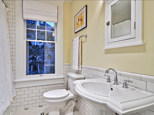

….our living room is painted a color with a golden undertone, very subtle but lovely…

ALL of these “YELLOWS” are timeless.
AND VERSATILE. They look great in combination with pale blues and sort reds, greens and pinks…even Black……they are warm and inviting and relaxing and cozy and can be appropriate for nearly all styles…be it ….
Mid-Century Modern or Vintage or Cottage or Country or Arts and Crafts, Colonial Revival.
DO YOU HAVE A FAVORITE “GO TO” INTERIOR YELLOW???
have you ever had a yellow mishap?

In color / psych theory it is said you can’t have a fight in a yellow room, but my hubby and I have proven you can have a heated debate over painting a room yellow! Yellow wall paint is so tricky in my experience. I totally agree with you that any color with the word “yellow” in the name is a bit of a cautionary note. In my opinion, even Hawthorne Yellow … I’ve seen it in rooms where it makes a fresh backdrop … but then I had the LR, FR and laundry painted Hawthorne Yellow and they all were repainted as quickly as I could manage it. An underlit room gives a sad drab heavy Hawthorne Yellow. A bright natural light room makes HY go neon. And in a small room lit with a flourescent ceiling fixture (laundry) it was overpowering and claustrophobic. Just some details from our color experiment; although as I’ve said, I’ve seen it work in rooms but I can’t quite figure out what made it work.
I know exactly what you mean…there is nothing sadder than a SAD yellow!!! And I have seen the HY neon..oh yes!
I also like yellows. These colors are creamy and warm, and though they are very pretty, I am a “cool color” person. I like my yellows light and airy, to go with blues, greens and violets.
I am getting ready to paint LR/DR, and so far I am liking Clark & Kensington “Winter Sun.” I am also considering Glidden Sail Cloth, or Capri Cream.
Do you have any suggestions for light, airy yellows? I agree that it is tricky, and this holds true for the cool yellows too, as they can easily end up looking fluorescent green (and sort of trashy). Thanks in advance!
I should add that “Winter Sun” is not a web safe color. If you Google it, it looks beige. It is actually a pale yellow with a chartreuse undertone.
I’m having a “yellow mishap” as I write. Loving the light, airy yellows, Clark + Kensington Winter Sun looked perfect. It really made all other colors in the room pop! I got a sample, and so far, so good! Then I got a quart of eggshell, and painted one East wall, and a small part of a North wall. (Both the sample and quart were mixed into Valspar pure white base, as they didn’t have the right base to mix it up in C+K).
As it went on, I was excited – it looked so beautiful; a clean, pale ethereal yellow, in which the pure white base was also evident. I felt almost as if I could levitate looking at that color!
As it dried, it started looking chartreuse on the East wall, (North wall looks good), but as it cured, the green seemed to decrease. I thought maybe I would come out of it okay, but now, if I were to describe the color and give it a name, I think I would have to go with “Dusty Faded Tennis Ball.” I am so disappointed.
Still looking. I DID notice that the sample, when painted on side by side with the quart, doesn’t seem to have as much green. I also used the sample to paint a window frame in the stairwell, and it still looks perfect every time I see it. I might take the sample back in, and see if they can simply multiply THAT formula to make up a quart.
YES!!! I learned this after too many quarts of “samples” which I thought were “just right” every time…those rich, beautiful yellows are usually NOT called yellow! After lots of trial and error in our last home, I finally landed on a warm yellow tone for our current house that looked more like wheat on the color chip – it’s called Autumn Wind and I bought it at Lowe’s. I do love it but I also adore the rich cream color shown above!!!
Lesson learned: definitely go with paint SAMPLES, not quarts (or gallons!) – haha!! BTW – I ended up going with a “gold” tone in the house I was having so much trouble with and it looked really warm with the deep brick red we chose for the dining room!
Leah: )
Comrades in Yellow!!!! Glad you found a good one!
My favorite go to “yellow” is Valspar Woodrow Wilson Linen. It is very close to the cream on the Mary Baldwin College buildings. I have it in both my rentals right now.
Great post. I absolutely love yellow. These are beautiful examples. Love your blog. Your paintings are amazing.
aw Debbie, you make me blush…thank you for the ongoing support!
[…] yellows that you might otherwise have trouble communicating when you choose a paint. Learn more. […]
Does anyone have a good suggestion for a warm white to pair with the lovely Windham Cream shown above. The white will be for the trim and ceilings in our basement. (Sage carpeting throughout.)
I am loving BM Chantilly lace OC65 right now…
Just found this great post on Pinterest! I have another to add to your list and it follows your rule of “yellow” not in the name. It’s called Burnt Glaze and it’s in the original paint deck for Martin Senoir colors. It looks like a stick of butter on the walls! M.
Awesome thanks!!!!
I thought I wanted BW Concord Ivory..but it was too bright. I ended up with SW Convivial Yellow. Its got a little grey in it and I love it. 🙂
yes Concord Ivory is a very deep color…It sounds like you found the perfect one..I will have to check that one out!I love grayed down yellows!
Wow, I never thought I would paint any room in yellow, but now I’m really thinking about it ! Thanks for these inspiring pictures !
Lisa
My living room is Cream Yellow from Benjamin Moore, and it makes me so happy every day!
oooohhh sounds beautiful…I LOVE Yelow living rooms…send me a picture!!!! xo
Your post is extremely helpful. Love yellow softness not lemon sour yellow. Have you seen BM Man on the Moon? I’m planning a major living room change with a goal of soft, soft, soft.
Yellow is hard. And beware of testing a new yellow on the walls of a too-yellow room: anything will look toned down until you have a room of it. We just painted a room in Pale Straw, but on the wall it looks cold and too bright, like a substance you might get uranium from. And in reflected afternoon light it takes on a lurid green hue, like a color Toulouse-Lautrec might have used for absinthe. I’m putting my hope in Windham Cream.
Butterfield, Ambiance, and Filtered Sunlight, all by Benjamin Moore! Pair with Simply White trim, they’re all perfection. At our old house we had Butterfield throughout, with an Ambiance accent wall in the dining room, loved it. In this house, the lighting is different and Butterfield didn’t work, sadly. Instead we have Filtered Sunlight in the kitchen and laundry room and I adore it, it’s gorgeous. I’d have done Filtered Sunlight through the whole house if my husband would have let me get away with it!
Summer Hue by Dunn Edwards is another good one, I am currently lobbying to paint our exterior in Summer Hue, with white trim and robin’s egg blue accents.
I’m a bit of a yellow addict!
I have found, as many of you have, that yellow is a complex, mostly unforgiving and delightful color. There are no easy answers to selecting the right shade, both exterior and interior. However, one hint might help. It seems that many yellows can be grouped into blue or green leaning and if you pair them correctly with the appropriate color fabrics and accessories everything is harmonized. Any mismatch in the blue/green formula, no matter how slight, will eventually create tension, headaches and you will never be happy with the look. My go to yellow(green leaning) is Mannequin Cream. It has the amazing property of maintaining its light color and vibrance on poorly lighted interiors and still be subtle and creamy in open bright light.
thank you for such a helpful reply! this post is my MOST POPUAR POST – I think finding the right yellow is about the hardest thing a homeowner can face….in “first world problem” land of course....
We live in Western Washington where the skies are gray a good portion of the time. We agonized over paint color for our living room/dining room and down the hallway and stairwell. We ended up with Montgomery White and love it. It’s so warm and inviting without ever feeling really yellow. More of a heavy cream. I’d use it again.
This is so helpful for me. I live in Bellingham, WA. and I have a hard time with Yellows, even when picking creamy colors closer to white, due to the overcast skies. Thank you!
Thank you! I was looking for a “rustic” yellow color for my kitchen, and I think I found it here thanks to you, what I am loving is the “rich cream”! Exactly the color I was picturing in my head!
Awesome! Yellows are tricky! so glad I could help!
Thank you for such a helpful post. We used SW Ancient Marble in our previous home and it’s a great color but, doesn’t work in our current house. Can’t wait to change the color based on the suggestions discussed here!
Admiring the commitment you put into your site and in depth information you offer.
It’s awesome to come across a blog every once in a
while that isn’t the same old rehashed material. Excellent read!
I’ve bookmarked your site and I’m including your
RSS feeds to my Google account. http://extraluma.com/blog/12368.html
I want to change my front door to yellows immediately after seeing your post~ Yellow is so beautiful!
Late to the party here but I LOVE this collection of yellows!
Thanks for the information!
Definitely pinning.
xo
i took2 years to pick my favorite yellow paint chips on the wall seeing it in different light i weeded it down to 3 colors asked my husband what he liked he said he didnt like one.so i choose my favorite.SUNBEAM YELLOW its a pale yellowthat looks wonderful in any lite.we are painting our living room have 2 walls to go.i love it lifts your spirt and makes you feel happy.
Can you offer suggestions for creamy whites to combine with a pale yellow for stripes? Also looking for bedding in yellows and creams if any suggestions?
Hello!
I’m a yellow lover!!
I have a yellow by MS called Pencil and I just lurrrrve it! The shades changes all the time in the room that faces north east
Now we have picked Hawthorne Yellow for a guest bedroom but I am stumped WHICH color white for the doors and the trims would make the yellow stand out beautifully!.?
all my trim is cottage white by behr, would like a “yellow” that would go with it. any suggestions? the living room is very dark with very little natural light.
Also looking for a suggestion . . . LR painted stonington gray with bright emerald, black and white furnishings, dr revere pewter with more greens and golds . . .looking for a yellow for a hall that separates front and back of house that will not fight either the grays or golds . . .thinking maybe weston flax . . .love the creamy yellows but need greater contrast against the white in this particular spot
Just found this very helpful blog page on Pinterest. Thank you for the guidance, not only on your post but also in the comments.
I have found navajo white beautiful with yellow~
Compatible Cream is a favorite- but i believe it is a Sherwin Williams.
Ill check out the navajo white as i am redoing my room from creamy (yellow) creams with browns
to a more goldenrod fabric on 4 chairs. I want something tat pairs well with the brighter yellow gold but not more “yellow” thanks for the inspiration gals- good timing for me!
Benjamin Moore Mayonnaise works beautifully with Montgomery White.
Any suggestions for a creamy yellow to go with a denim blue?
I love Gold Tone and Lemon Chiffon, both by Benjamin Moore.
Benjamin Moore Cream Yellow has been my go to yellow for 23 yrs in 5 homes.