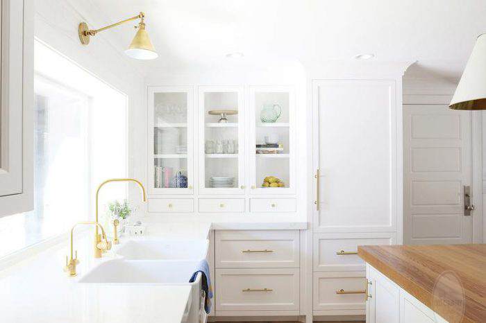
The first step in our KITCHEN RENOVATION was to replace the cabinet doors...( 1, 2, 3, 4, 5)
….somehow I knew that if the Doors and Drawer fronts were updated….the lines cleaner…more contemporary – I knew that YEARS could be taken off our 50-year-old kitchen…
And so we began.
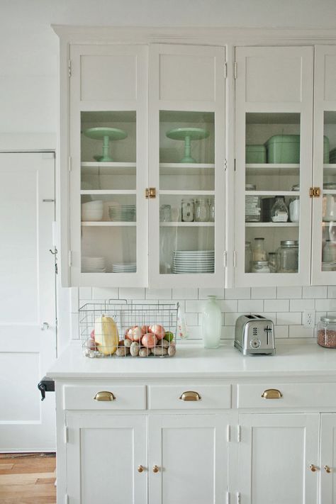
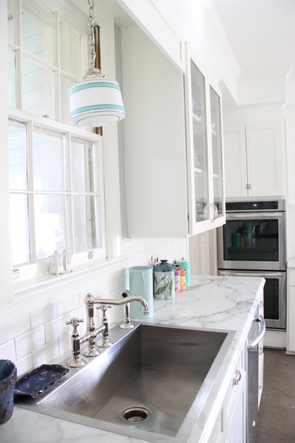
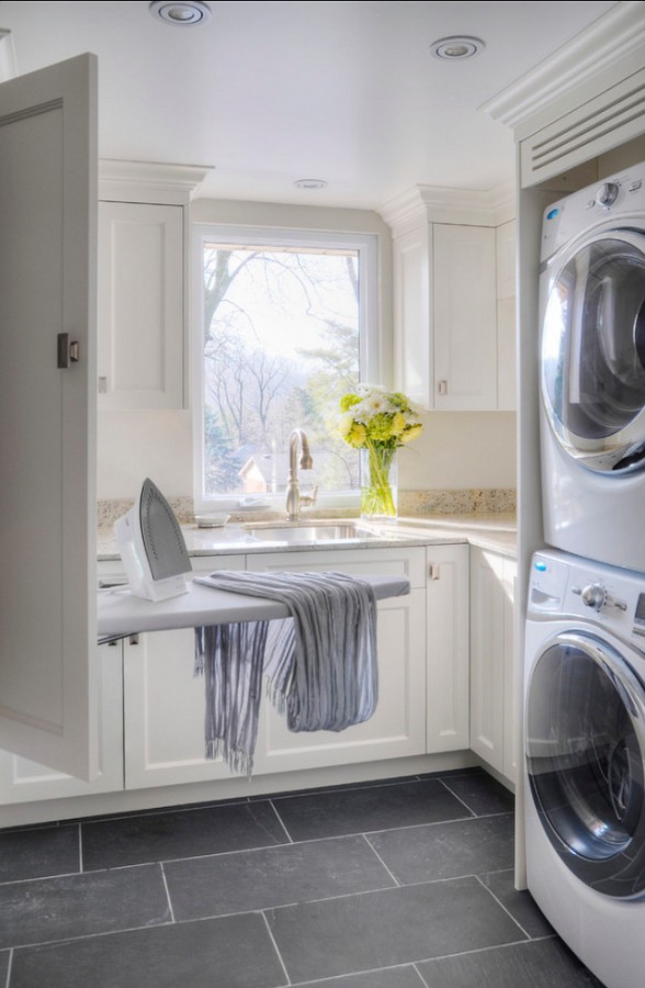
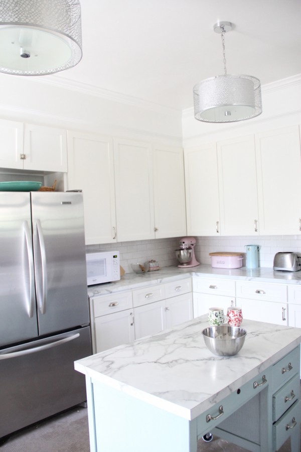
Stage one of the facelift involved installing new cabinet doors and drawer fronts. The old cabinets were installed in 1967, but the ORIGINAL FOOTPRINT WORKED and to tear them all out, only to replace in the SAME PLACE – would not be a wise use of our dollars. WE decided to replace the doors and drawers with a 1″ overlay, almost covering entirely the boxes and making them look like almost new. I researched doors and carpenters online and settled on a great guy in Kentucky. Hunter’s woodworking. Ask for Charlie. He has the patience of a saint!
Measuring out the doors and drawers was huge undertaking, especially for me, but after much obsessive measuring and check-double checking, I got it done, the numbers sent off and the doors were made.
While measuring each door and drawer was tedious work – it paled in comparison to
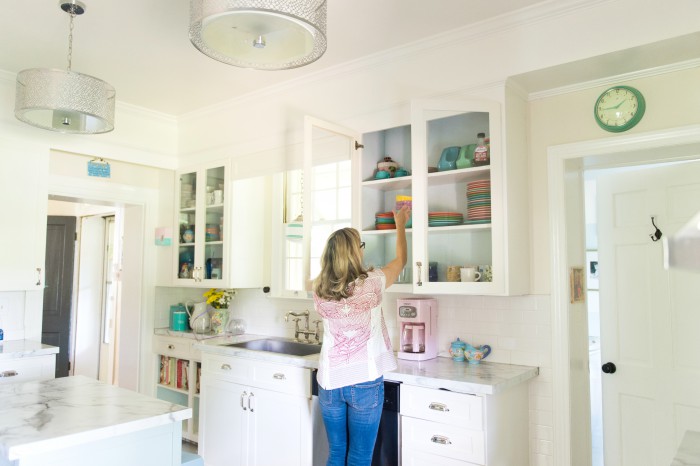
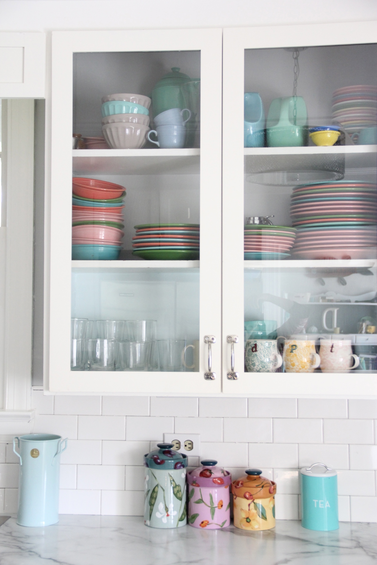
…choosing the RIGHT WHITE color for the cabinets!!!!!
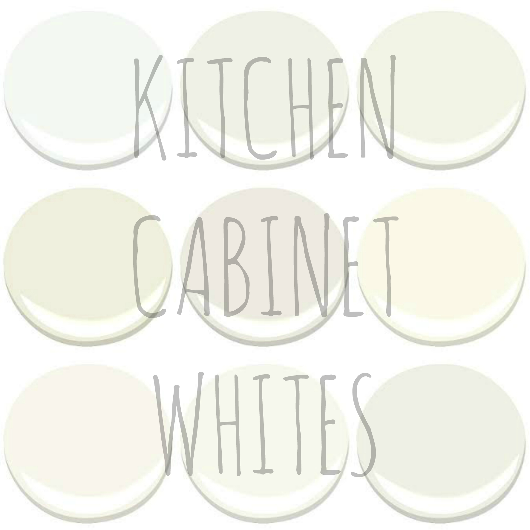
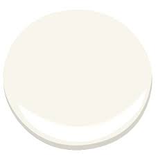
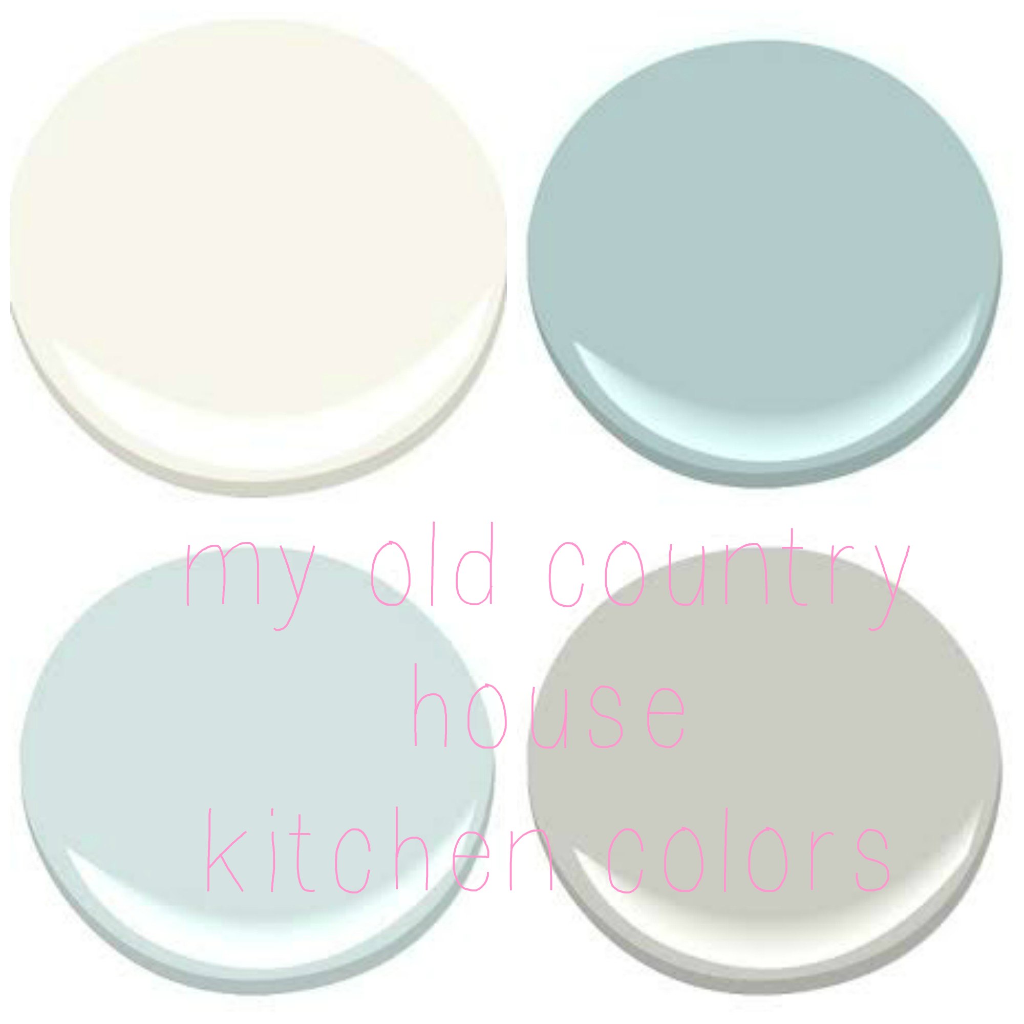
Chantilly lace is the “coolest” white, with a blue undertone. This does not mean it looks blue, it just means that it leans toward a cool white vs a warm white.

ONE MORE – MOONLIGHT WHITE was a close runner up had a grayer undertone.
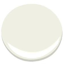
THE other Colors I tried were: “GLACIER WHITE”, (too grayish (FOR ME), “CHANTILLY LACE” ( a GREAT “PERFECT WHITE” but I wanted a bit more depth in the kitchen) but it is gorgeous and I ended up using it on ALL my interior trim, “ SIMPLY WHITE” ( I LOVE but has a gold/yellow undertone – making it perfect for our HOUSE exterior which is where we used it), “MARSCAPONE” was ALMOST perfect but still a tad too yellowish – white, “DEEP IN THOUGHT” almost, but too dark. “WHITE DOVE”, “CLOUD WHITE” AND CLOUD NINE” were all very very CLOSE to perfect , but in the end their undertones did not work.
What I came to realize is that in my 130 year old house, a too white white looked incredibly out-of-place, like it landed there from outer space. But too “yellowed” look contrived and old….I needed an in-between clean white – with a very neutral undertone.

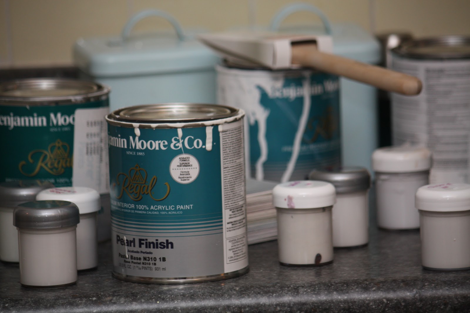
SAMPLES! ALWAYS TRY YOUR SAMPLES OUT IN THE ROOM!!
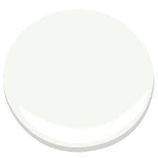
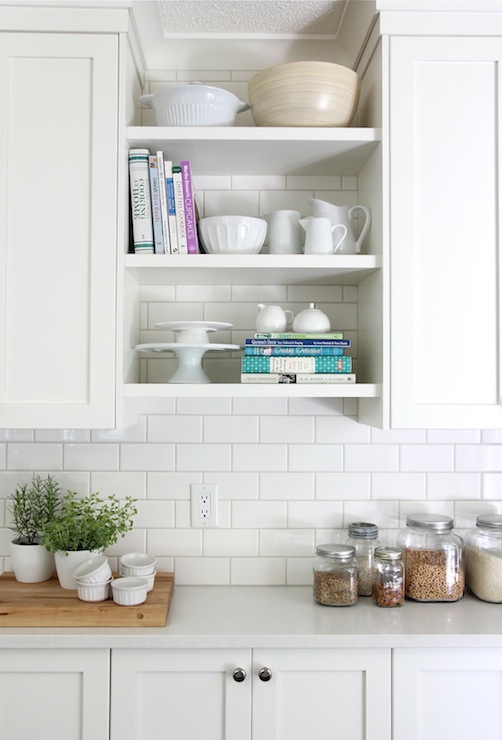
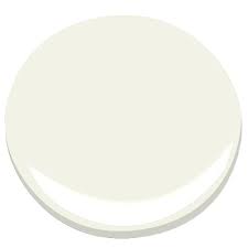
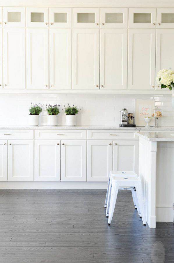
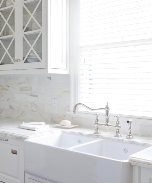
THE TIPPING POINT WAS A SUGGESTION BY “TRUE COLOUR EXPERT” MARIA KILLAM WHO RECOMMENDED “MOUNTAIN PEAK WHITE” AS THE PERFECT WHITE WHEN PLACED NEXT TO WHITE SUBWAY TILE WHICH I KNEW I WANTED TO EVENTUALLY USE FOR THE BACK SPLASH.
CHOOSING COLOR CAN BE A DAUNTING EXPERIENCE AND CHOOSING A WHITE COLOR CAN TAKE DAUNTING TO A WHOLE NEW LEVEL…AND YOU WANT ALL OF THE COLORS TO PLAY NICE WITH EACH OTHER!!!!
TAKE THE TIME YOU NEED AND SPEND THE LITTLE BIT EXTRA $$$ TO TRY SAMPLES…TAKING GREAT CARE TO PAY ATTENTION TO GRAY, BLUE AND YELLOW UNDERTONES. THE UNDERTONES ARE WHERE IT IS AT…AND WHILE THEY MAY BE SUBTLE IN A SAMPLE…BUT WHEN YOU MULTIPLY IT BY A WHOLE ROOM THEY CAN DOMINATE THE SPACE….
GOOD LUCK!!!
FEEL FREE TO EMAIL ME info@leslidevito.com with any color questions – I will do my best to help!!!
Lesli – does Mountain Peak have pinkish undertones? That is how it comes through on my computer in the example paint dot. I’m trying to decide
I have white subway tiles and as far as a “match” it appears Chantilly Lace is the best match but Simply White is very close and I am worried Chatilly Lace will be too harsh over such a large area. My hardwood floors are that yellowish (orange??!) color installed in the 90s.
NO, MOUNTAIN PEAK white does not have a pink undertone. It is a touch warmer than Chantilly lace. Chantilly is a more “white” white. painted nest to each other they are barely distinguishable from each other. In fact I have trim that Chantilly lace butts into MPW trim and only I can tell….I think you are safe either way.
I love white kitchen too! And it is easy to clean! Great photo selection!
Very impressive! Love it all, especially the cabinet. You have given me a great idea for one I own! Beautiful!
Thank you!
It seems to me that not too many people use Mountain Peak White. I love it—I painted our dark walnut beams and beautiful trim this color in 2003 and I still love it. It is a lovely cottage white in my opinion. We had painted our first floor a bright white when we first moved into our house but it read blue-ish and cold. Not so with Mountain Peak White. I love your use of it.
Kitchen design is the most desirable activities by any home-owner. The information you have shared is very informative.
This kitchen is absolutely breathtaking! I love everything about it.